Visa Co-Creation Workshop
THE SITUATION
Financial institutions, like most other industries, are eager to crack the psyches of those ever-elusive millennials. At the Visa Innovation Center, a client faced difficulty getting their millennial customers to activate their credit cards after approval. This is a huge missed opportunity in terms of both profits and growth.
THE SOLUTION
The client came to the Innovation Center to better understand the pain points and behaviors of this subset of customers. With two other designers, I conducted user research on millennials with rewards credit cards. We then facilitated a design thinking workshop with the client to share learnings, glean insights, and uncover concepts that could be translated into new product features or new solutions. Post-workshop, we tested these concepts with customers to validate interest.
MY ROLE
As one of the three designers on this project, my role involved:
User Research - Design Thinking Workshop - UX Design - Concept Testing
Discovery - Millennial Minds
The user research phase of this project was broken up into four main parts:
- Recruitment
- Discussion guide
- Interviewing
- Empathy maps
RECRUITMENT
Our aim was to find opinionated and talkative individuals. We were purposeful about finding millennials with diverse backgrounds (location, age, gender, occupation, etc.) who were also members of the client.
DISCUSSION GUIDE
The discussion guide was designed to probe for loves, hates, frustrations, judgements, and rationales. The main goal was to understand why customers were not compelled enough to activate their credit cards but our discussion guide was crafted to be flexible, allowing the conversation to wander into other related areas. Our strategy was to use the discussion guide as a rough outline and to let the conversation flow as naturally as possible.
INTERVIEWS
Given that most of the recruits ended up being on the East Coast or in the South, all interviews were conducted over the phone.
A few interesting (and surprising!) things we discovered:
Of the interviewees who never activated their cards or took a long time to activate their cards, the majority admitted that having to go check their mail was the #1 reason they didn't activate after approval.
Credit scores on the brain.Almost all millennials we interviewed are concerned about building credit and are hyper-aware about how a low credit score could affect their financial futures.
Ohana means family.Recommendations/reviews from family and friends are the most trusted sources when choosing and applying for new financial service products.
EMPATHY MAPS
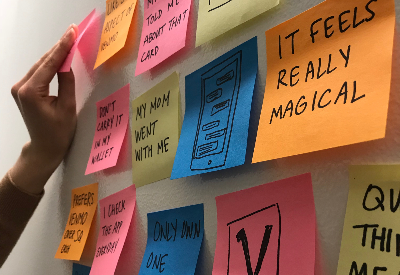
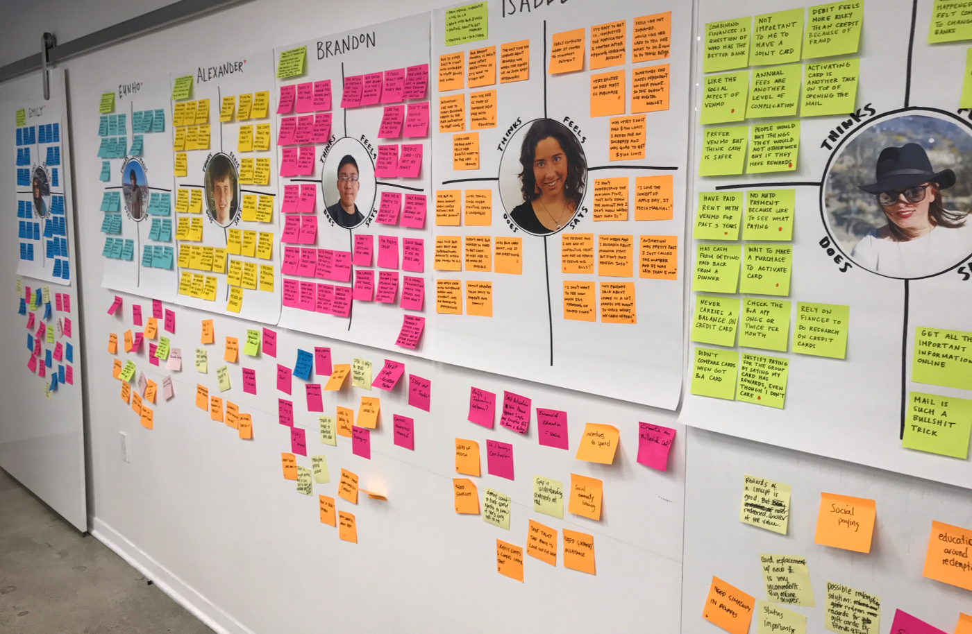
Time to put those copious notes to use! To capture our learnings, we created an empathy map for each interviewee that documented what he/she thinks, does, says, and how he/she feels. The process of creating the empathy maps involved combing through our notes, highlighting the parts of the interview that most accurately captured the individuals' thoughts and feelings, and organizing those snippets in the appropriate section.
Design Thinking Workshop
The actual co-creation workshop with the client was comprised of three main parts:
- Empathizing with the target audience
- Uncovering insights and top themes
- Translating the top themes into an optimal user experience
EMPATHIZING WITH THE TARGET AUDIENCE
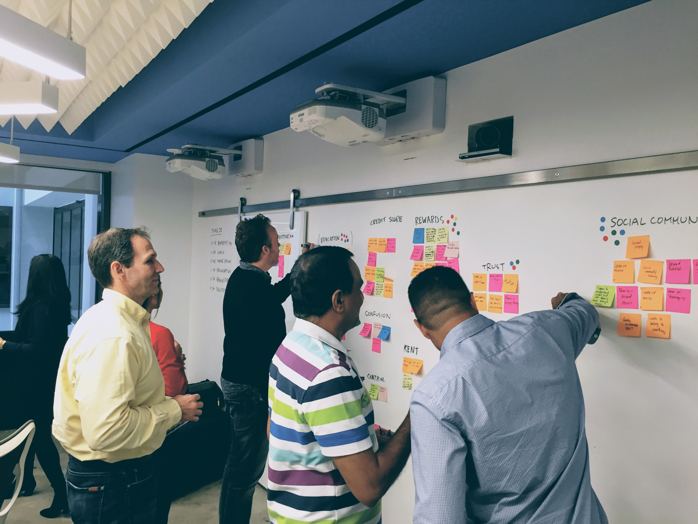
The first activity in the workshop involved sharing the empathy maps and having open discussions about the learnings. Everyone was encouraged to capture their observations and thoughts on post-it notes and stick them underneath the maps.
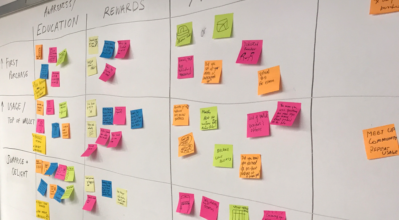
UNCOVERING INSIGHTS AND TOP THEMES
We then asked the client to collect all of the post-it notes they had written and to begin clustering similar comments together. Each cluster was labeled and everyone voted for the top three most compelling groupings.
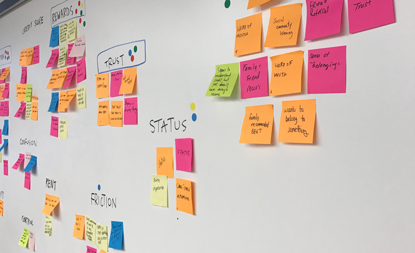
The top themes ended up being about rewards, trust, social community, and financial education. From there we transitioned into an ideation exercise. The goal of the exercise was to come up with ideas of how to increase activation or credit card usage AND promote rewards, build trust, leverage social communities, or incorporate financial education.
TRANSLATING TOP THEMES INTO A USER EXPERIENCE
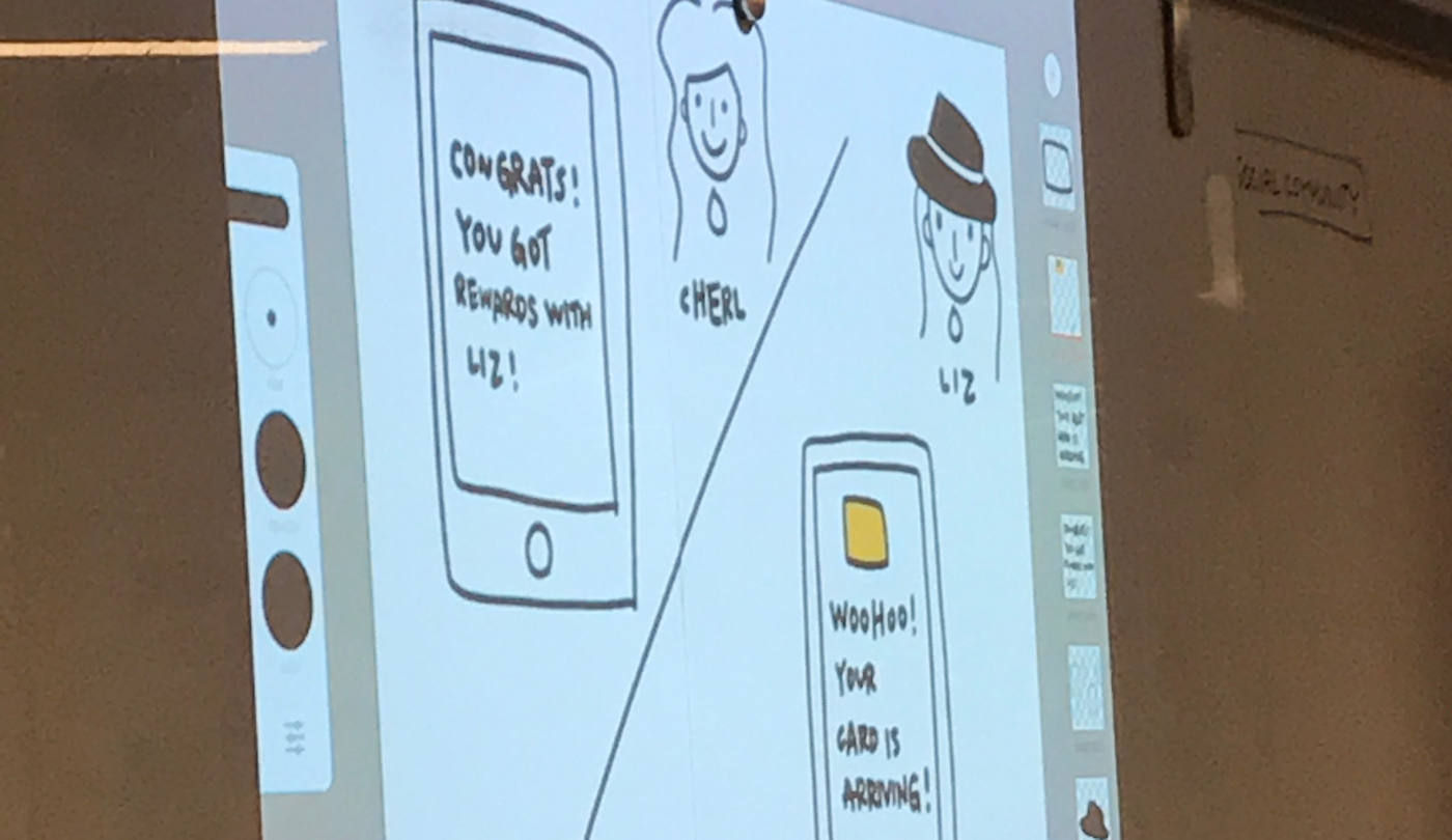
Finally, we had the clients put themselves into the shoes of millennials. Everyone was split into teams and we asked each team to choose an empathy map and apply the themes and ideas we brainstormed to develop a new way of solving for the activation problem. Each team was given a storyboard template and free reign to develop a user experience that catered to their chosen interviewee.
After all teams presented their storyboards, the most intriguing ideas from each storyboard were discussed and debated. The best parts of each teams' storyboards were combined into a final storyboard that chronicled the journey of Liz, the interviewee that the clients felt was most representative of their millennial customers. The storyboard outlines how and why she applies for and activates her new credit card and how she takes advantage of card's millennial-friendly features and benefits.
Prototyping and Concept Testing
Following the workshop, the design team committed to testing a prototype with users to validate the concepts that were included in the final storyboard.
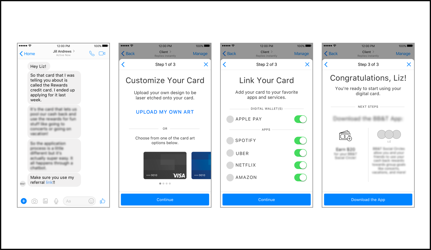
Our intent was to design a few user flows and present them in conjunction with the storyboards to help users get a visual sense of the themes we were trying to test. The screens that I designed were not meant to represent a full user experience but merely to provide visual guidance during user feedback sessions.
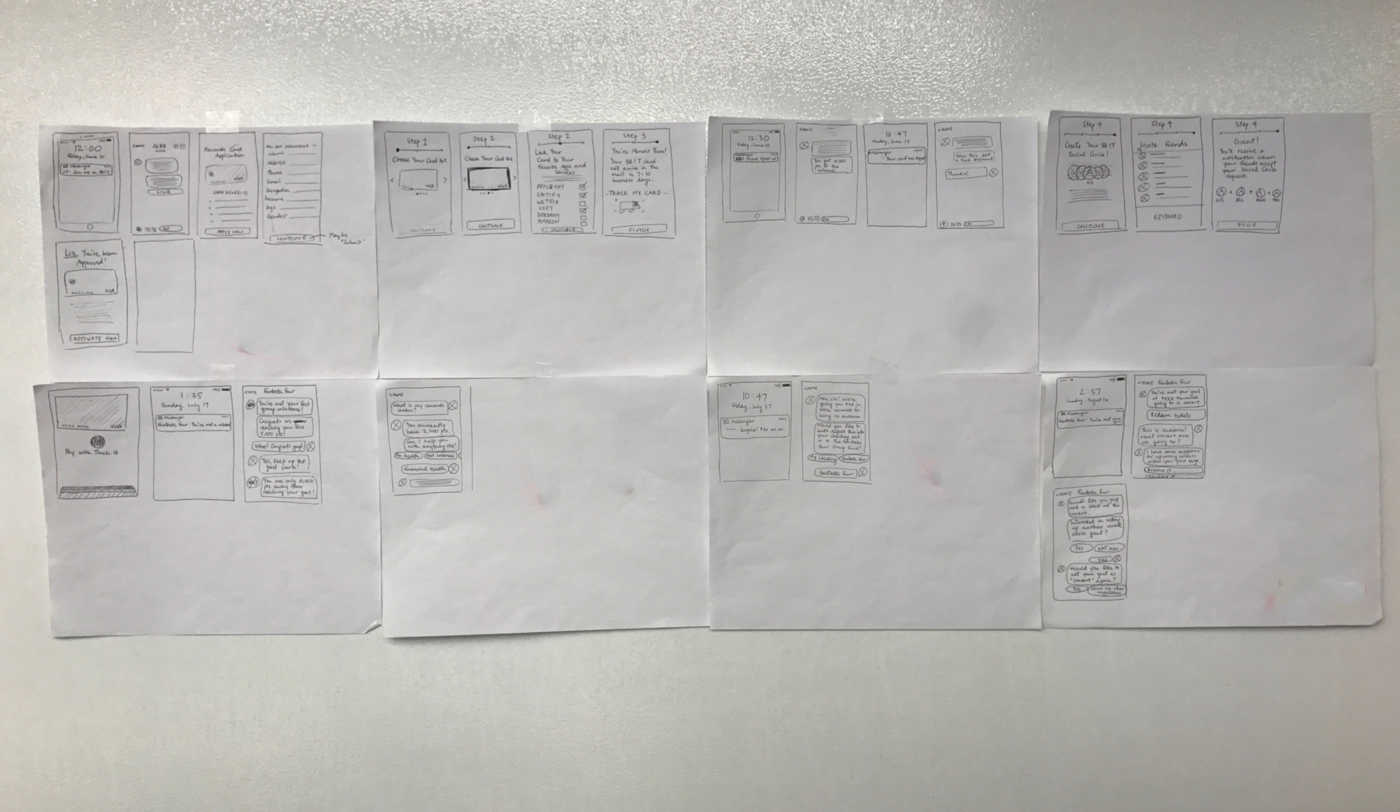
Paper sketches of select user flows
Select screens from the prototype. Some information blurred for client privacy.
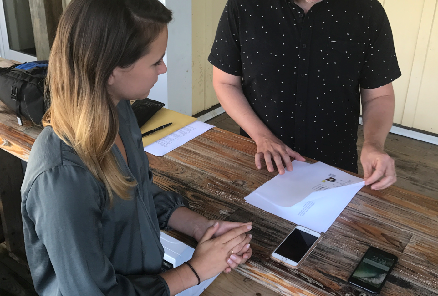
← →Once I finalized the prototype, we hit the road! User testing was conducted in two cities where the client had large customer bases. This time, interviews with millennials were in-person. We sought to get user feedback on the main concepts/product ideas the client was exploring, using the mobile prototype and the storyboards to illustrate how those concepts could be realized.
When testing concluded, we shared our learnings with the client. Currently, client is in the process of incorporating some of the feedback from user testing into upcoming product/marketing roll-outs.
