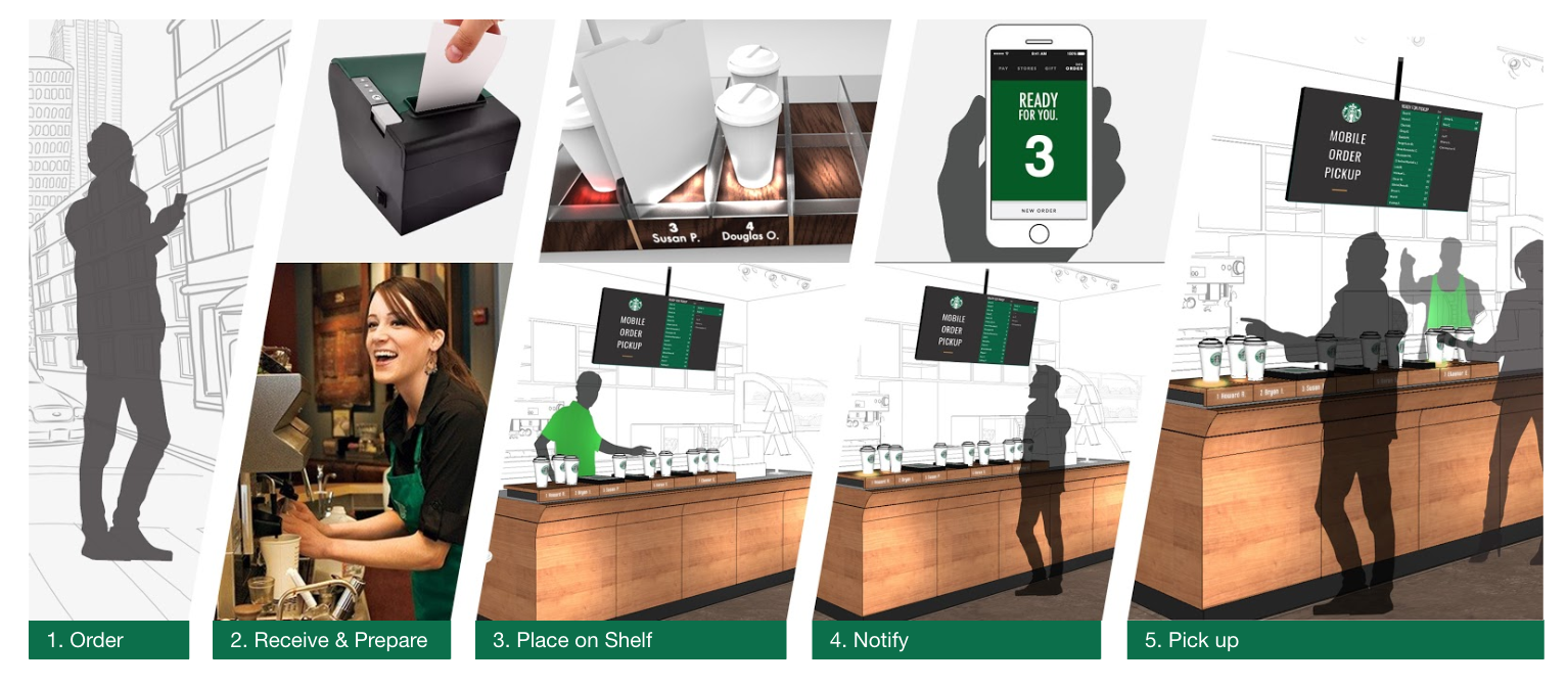
eatsa Status Board
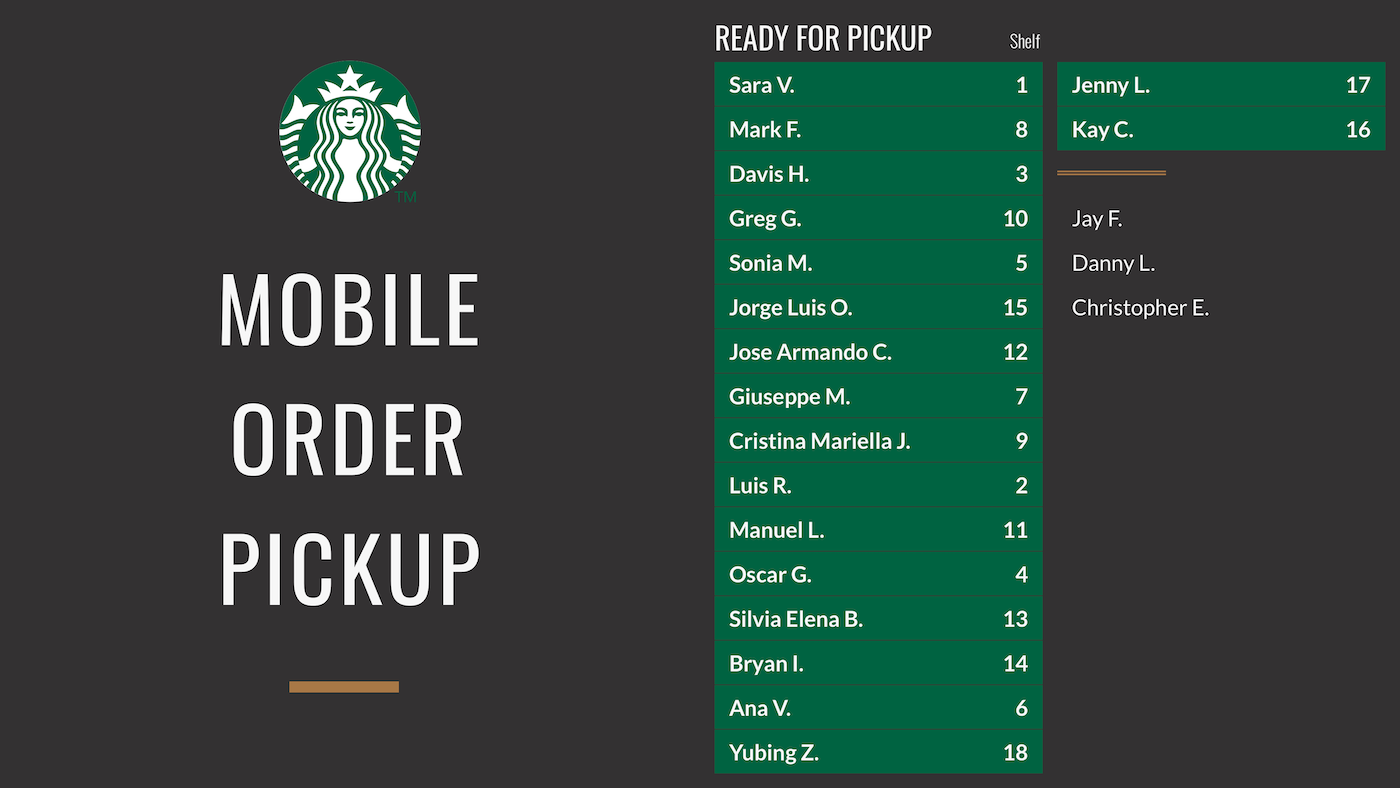
Historical Context
eatsa’s original status board is an order wayfinding tool. It keeps customers up to date on their order status and guides them to the assigned location where their food is ready for pickup.
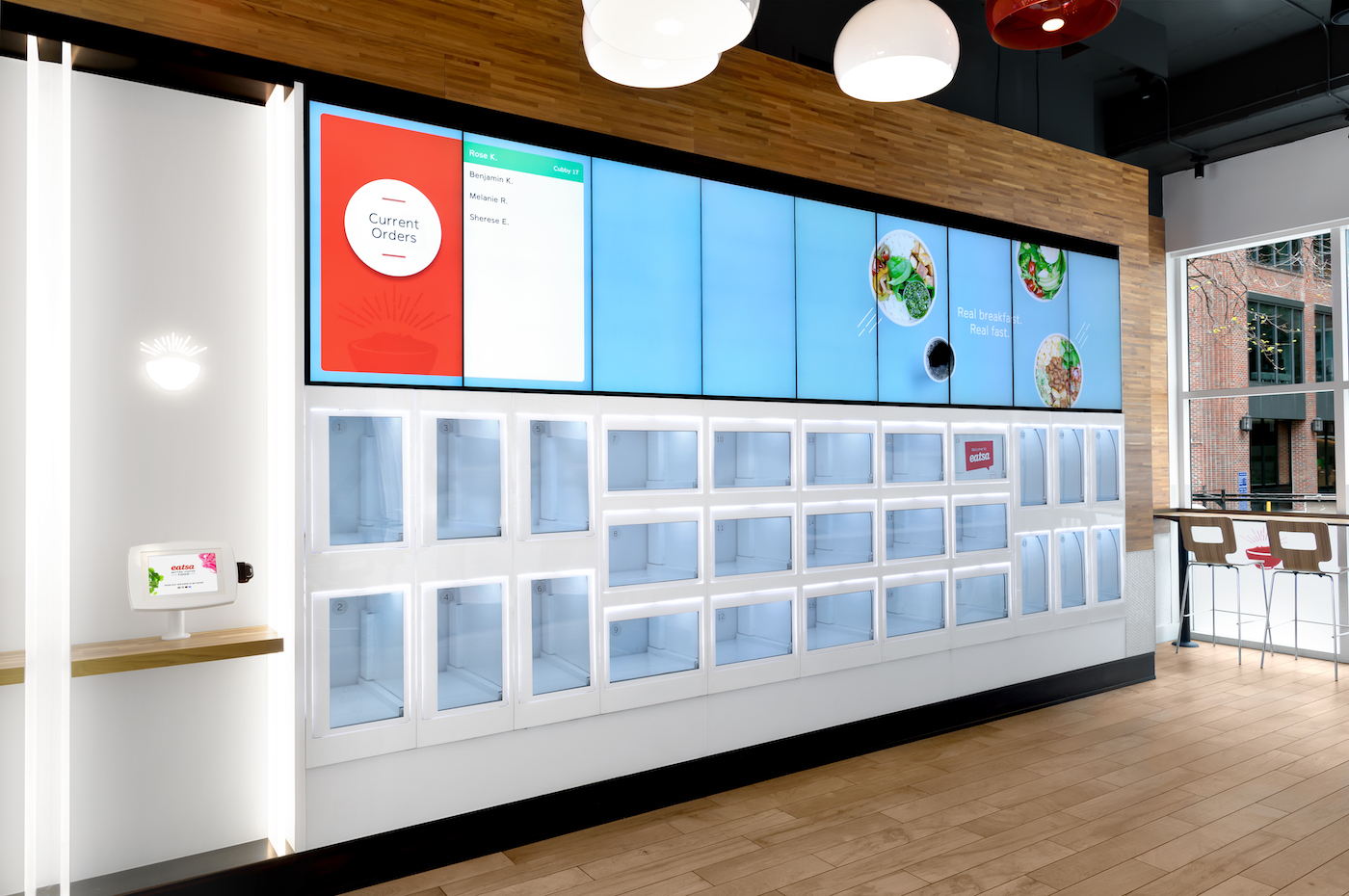
Status board is also valuable to restaurant staff. One of the most common interruptions restaurant operators experience is from customers asking about their orders. Having a status board reduces the number of employees tasked with direct customer support and allows operators to concentrate on their primary work with fewer interruptions.
Despite these benefits, many partners were hesitant to license status boards for their own restaurants. The cost of installing this wayfinding tool was too high. Status board is comprised of at least three 46” TV monitors and the cost of all this hardware across many locations is a heavy burden.
GOALS
I led the redesign of status board with the following main goals in mind:
- Create a single screen (i.e. one TV) status board to reduce cost to partners
- Develop a responsive design that could accommodate different screen sizes and orientations
- Make the visual aspects configurable so that partners could style it to match their brand and aesthetic
UNCOVERING OPPORTUNITY AREAS AND EARLY CONCEPTS
Multiple whiteboard sessions helped us determine how order state transitions, animations, information organization, and content would need to be adapted to fit into one screen.
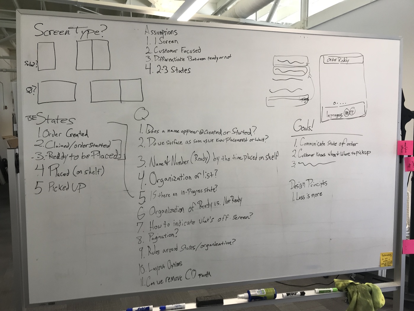
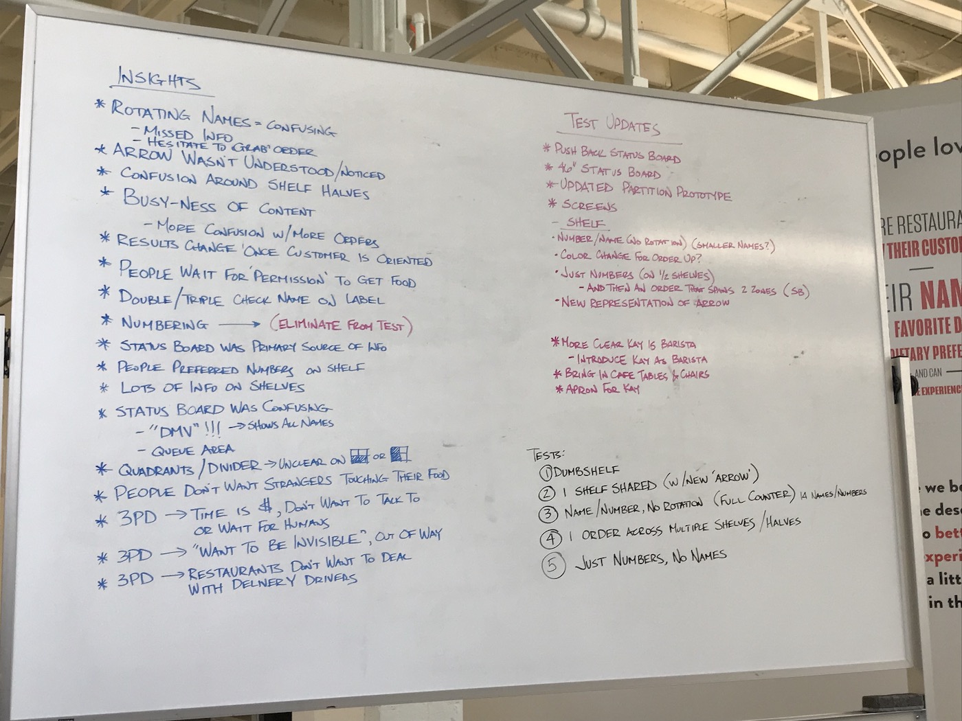
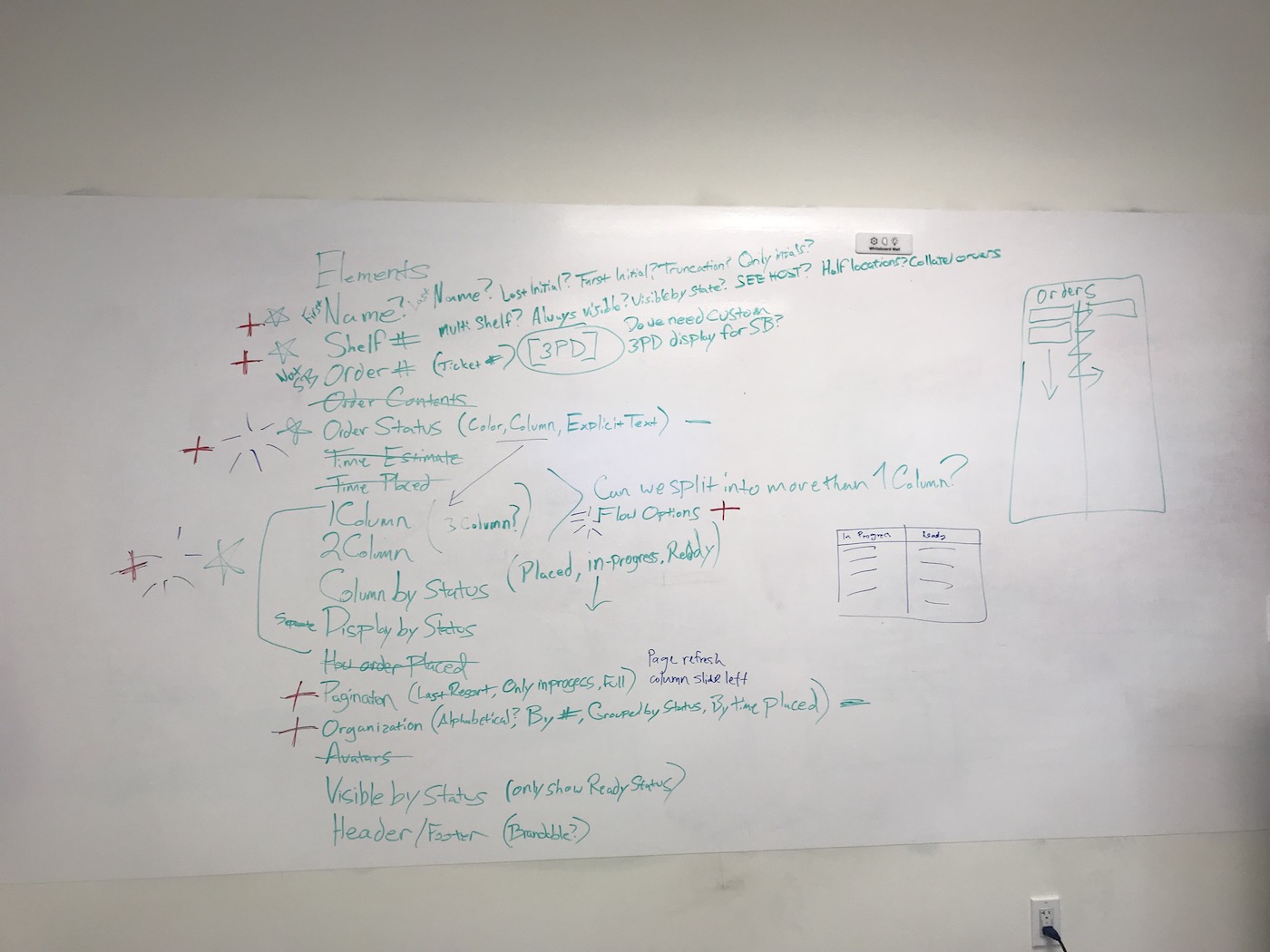
Some of the biggest considerations we worked through included:
- What does the screen look like when there are 0 orders vs. 5 orders vs. 50 orders?
- How do we handle situations in which there are more orders than can fit on the screen (order overflow)?
- Does the customer understand what their order status is?
- How easy is it for a customer to find their name if there are many orders?
- Does the status board match different operational workflows for order handoff/pickup?
- What animations would help convey orders moving through different statuses?
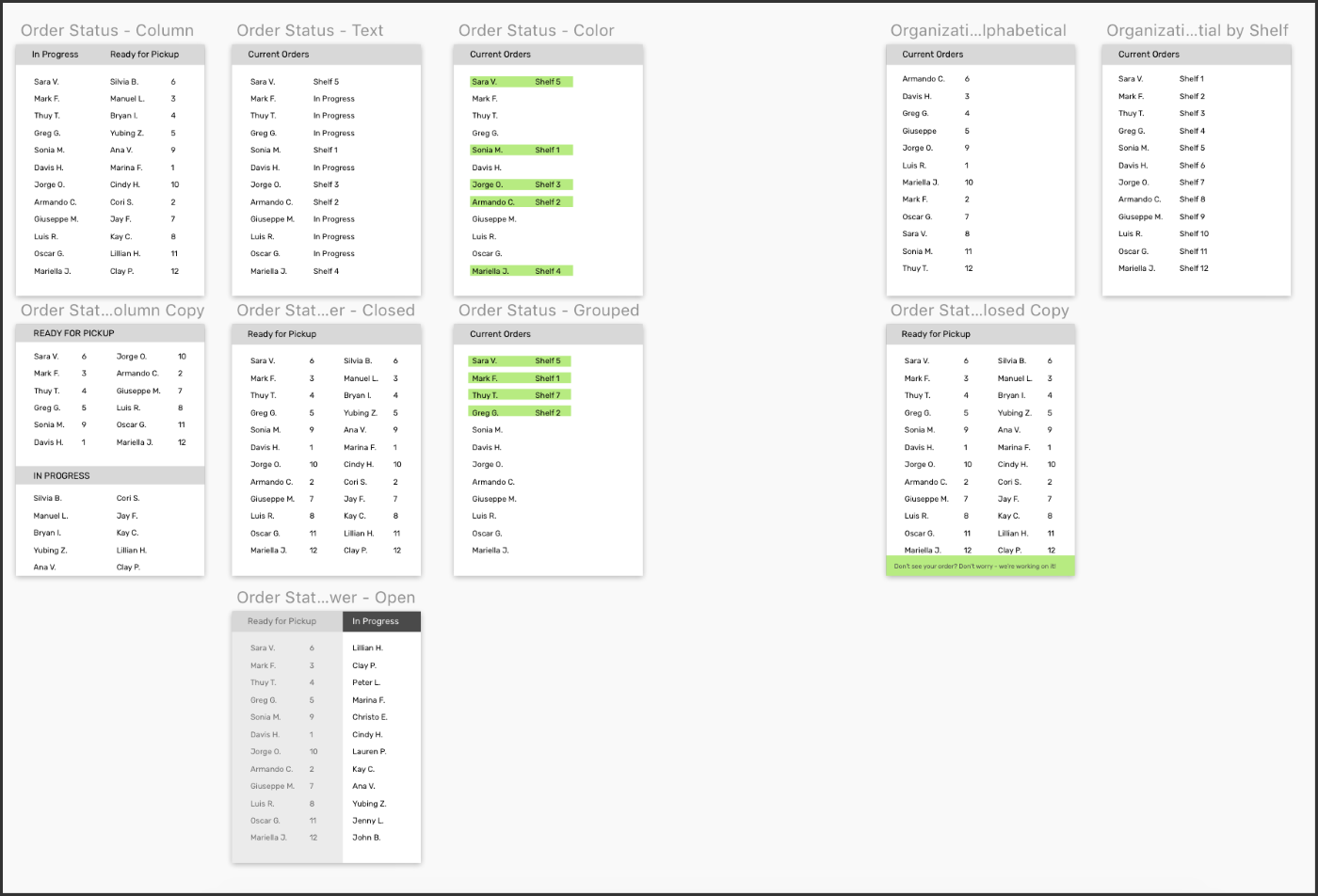
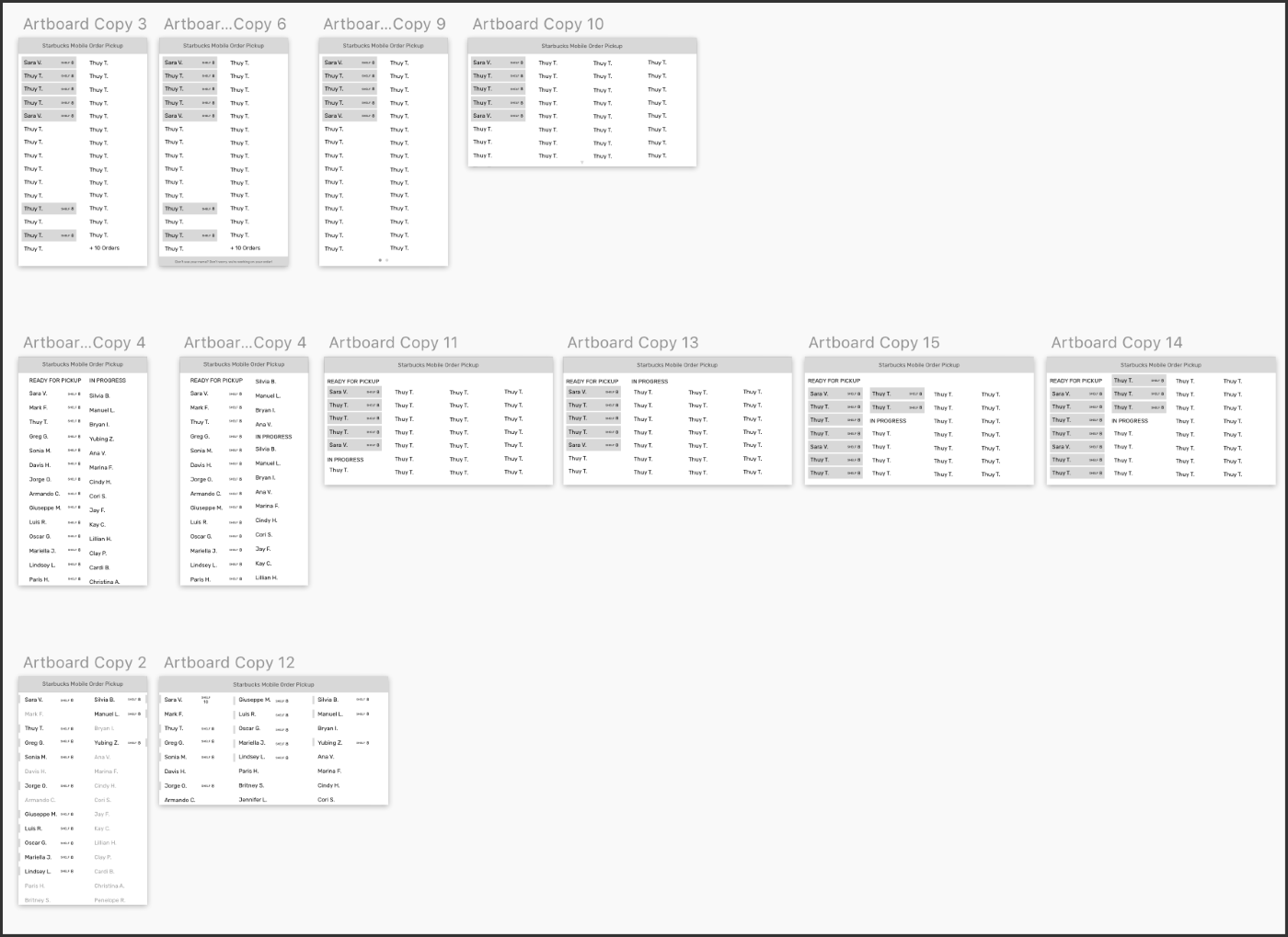
Early concepts to test UX and layout
← →HIGH IMPACT DESIGN DECISIONS AND PRODUCT FEATURES
Scales to accommodate information on screen
Whether the restaurant is experiencing a lull or the craziest lunch rush ever, the new status board flexes to use the screen space appropriately. This is accomplished by creating columns of orders, which are added and removed as necessary to display the current statuses. As orders exceed the space available, the status board transitions into corresponding overflow states.
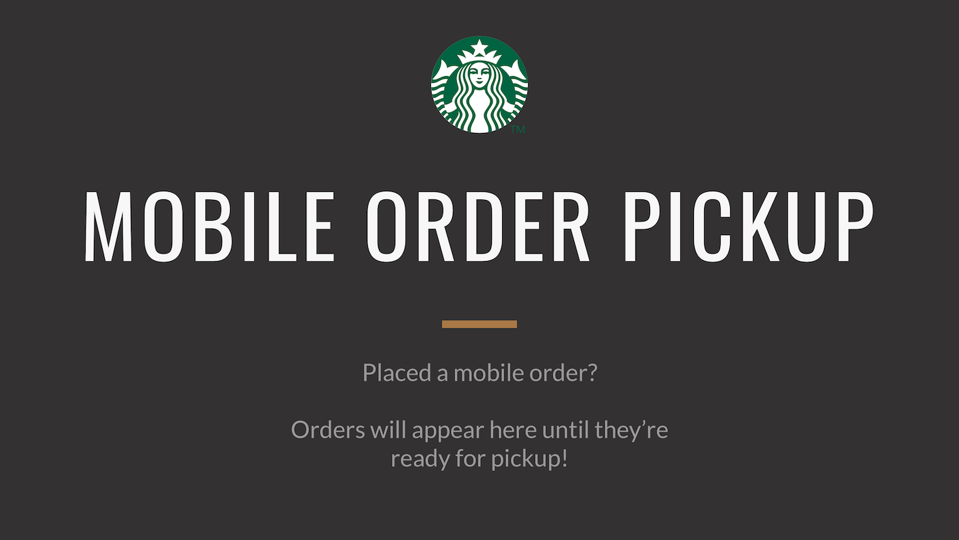
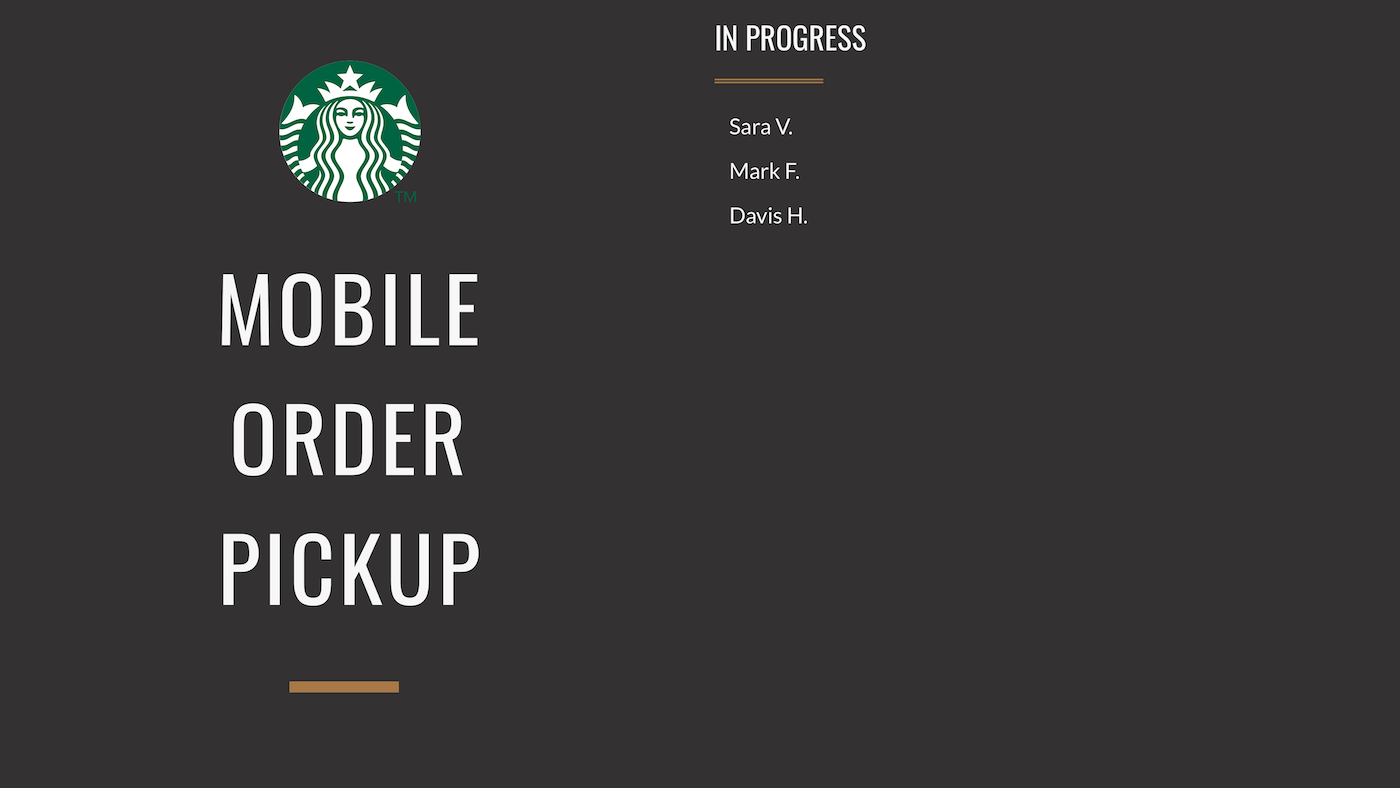
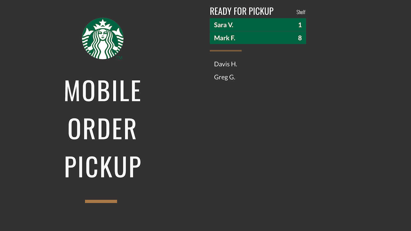

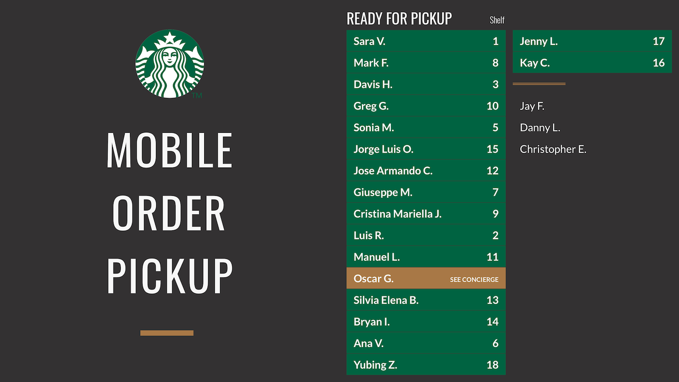
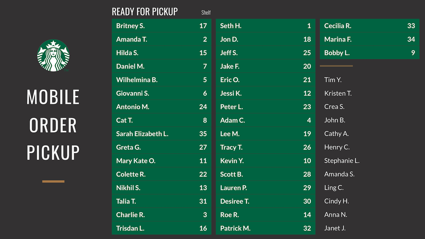
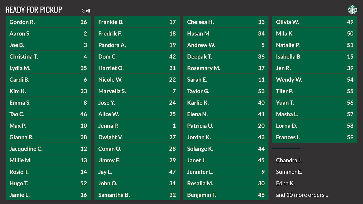
By default, half of the screen is reserved to display orders in 2 columns. As necessary, orders overflow into additional an additional 3rd and 4th column to be able to display all orders at once. At maximum capacity, the status board takes up all four columns of the screen (~60 orders).
← →Using Animation to Communicate Changes to Order Status
Animations play a key role in notifying the customer that their order is ready for pickup.
In addition to having "In Progress" and "Ready for Pickup" header labels, the name is first highlighted and then moved into the ready for pickup list. Highlighting lets the user maintain context on where their name is relative to the other names and helps them to anticipate a change in order status. Customers can watch as their name transitions into the ready to pickup list once their order is ready.
Visual Configurations
To make the status board match with each brand’s unique aesthetic, all of the visual components are configurable. Brands can specify their own type, colors, copy for headers, divider style, and digital marketing content.
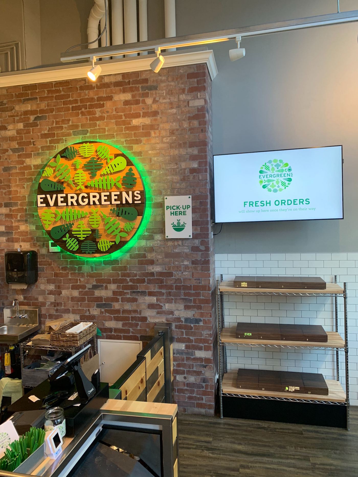
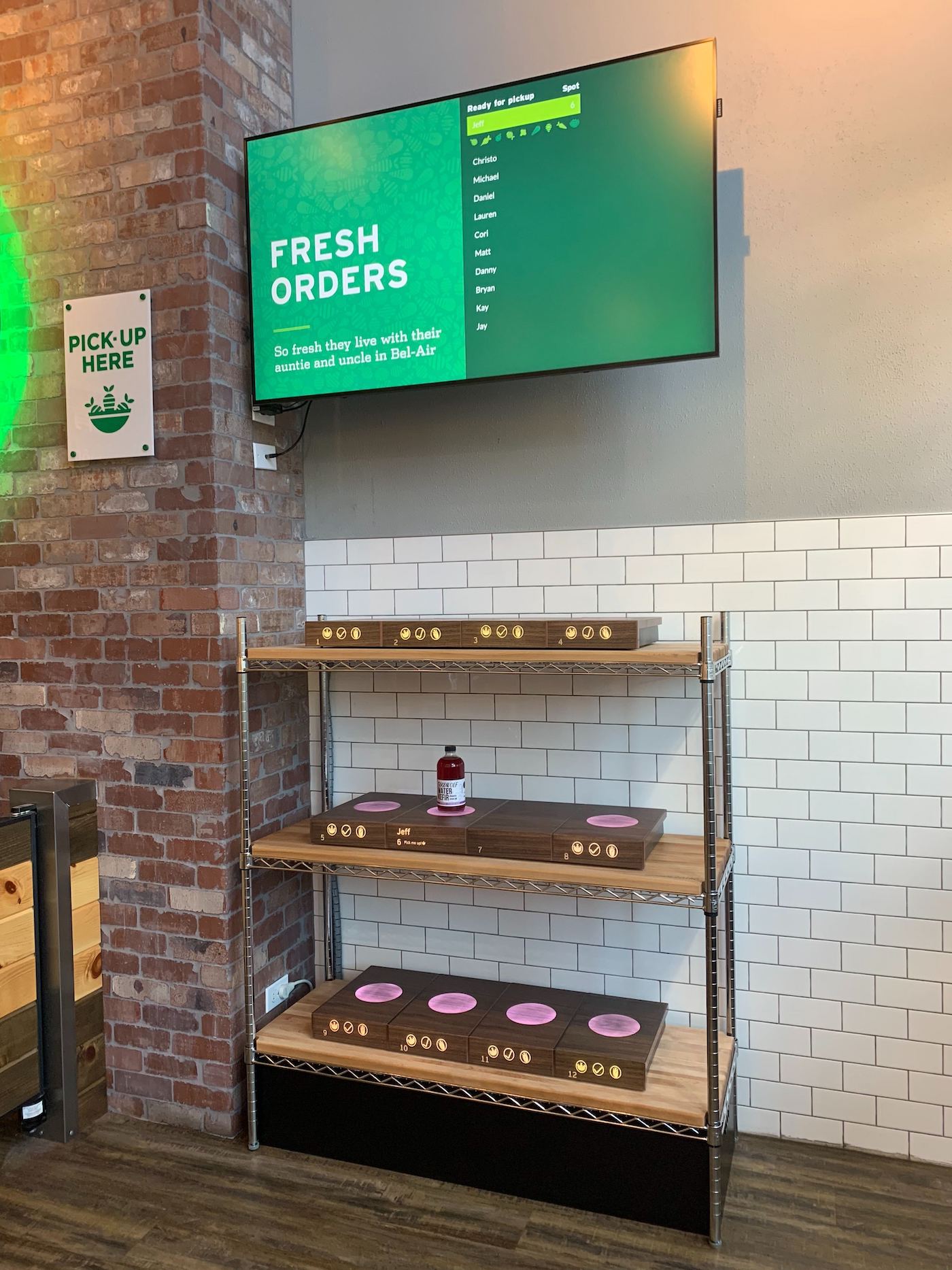
An example of a customized status board from one of our partners, Evergreens in Seattle.
← →FINAL DESIGN
