eatsa Restaurant Operations
THE SITUATION
Working in a restaurant kitchen during lunch rush is a terrifying experience. It’s hot, it’s cramped, it’s loud, and people are doing a million things all at the speed of light. Back of house operators are cooking, assembling, and delivering orders to hungry customers in 5 minutes or less. But they often lack the tools necessary to do this job as easily and quickly as possible and instead rely on antiquated displays, a mess of paper tickets, or pure memory.
In an industry where speed of service and order accuracy dictate so much of a restaurant’s success, there is a huge opportunity to create tools to improve the order fulfillment process and help kitchens move faster and make fewer mistakes.
THE SOLUTION
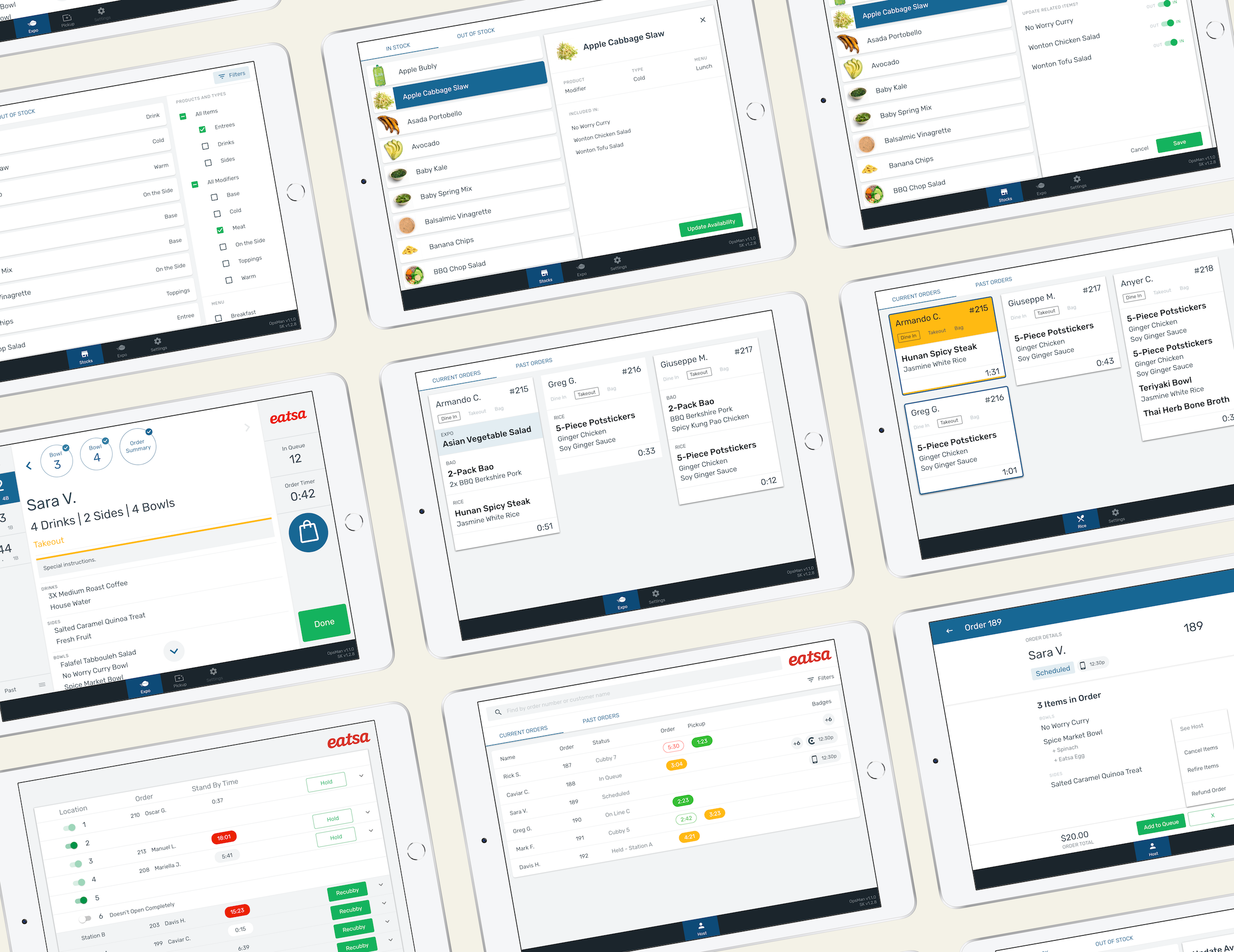
eatsa’s operations manager (OpsMan) is the collective name for software that helps operators work on the eatsa platform.
Fulfillment Views display orders from all order channels (in-store, mobile, kiosk, third party deliver partners like Uber Eats or DoorDash) to operators in flexible, configurable formats that support operational workflows.
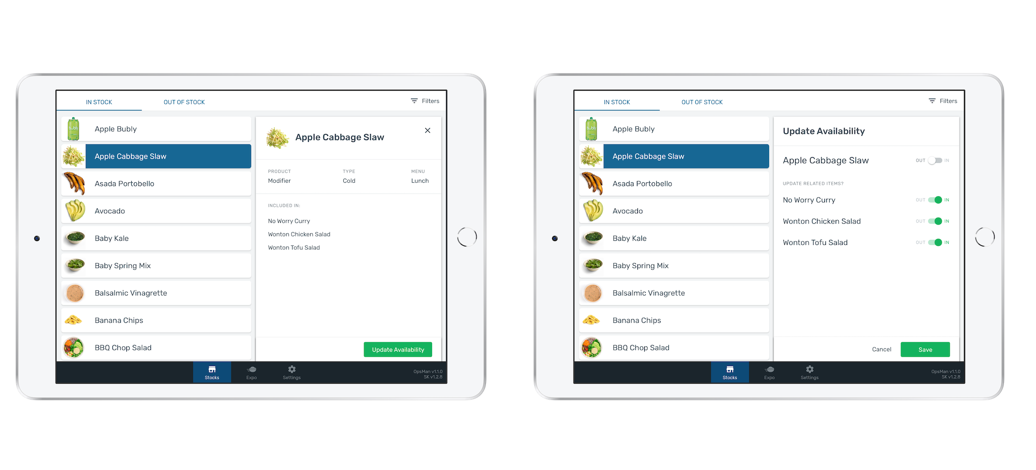
Stocks View enables back of house to mark menu items as temporarily out of stock on all integrated ordering channels.
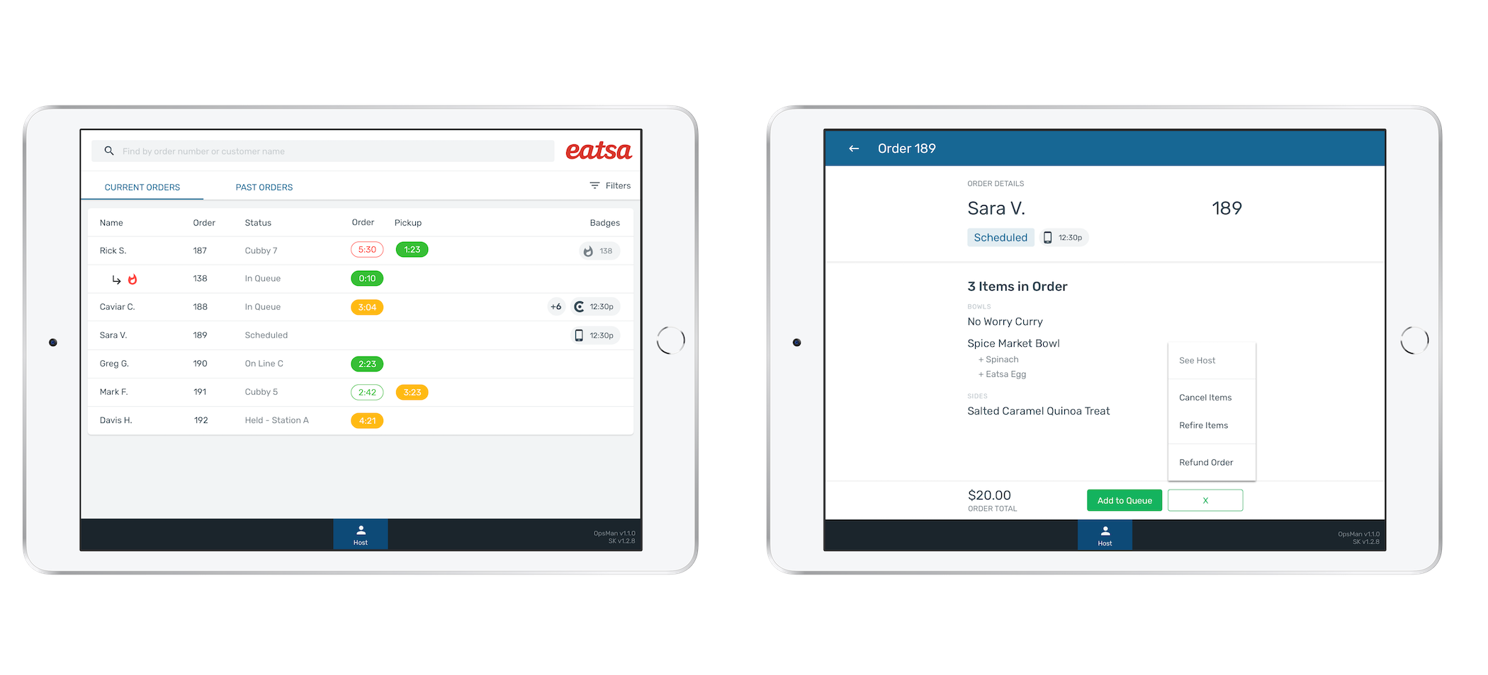
Host View provides a holistic overview of all customer orders and helps facilitate customer support.
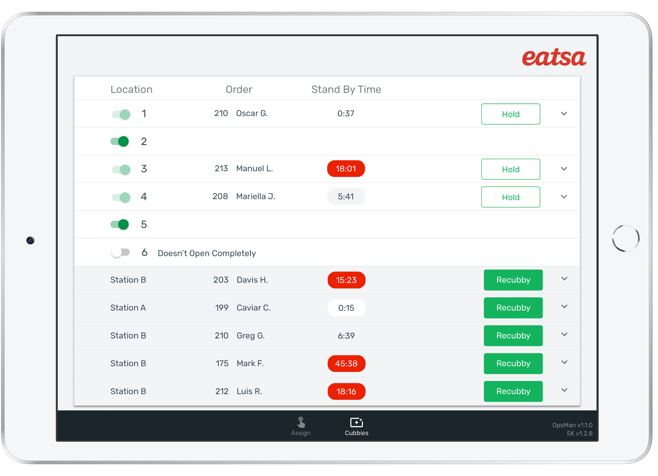
Pickup View shows orders that are either in progress and/or waiting for customer pickup. It allows operators to manage the location assignment of those orders to an eatsa cubby, shelf, or to hold the order in back).
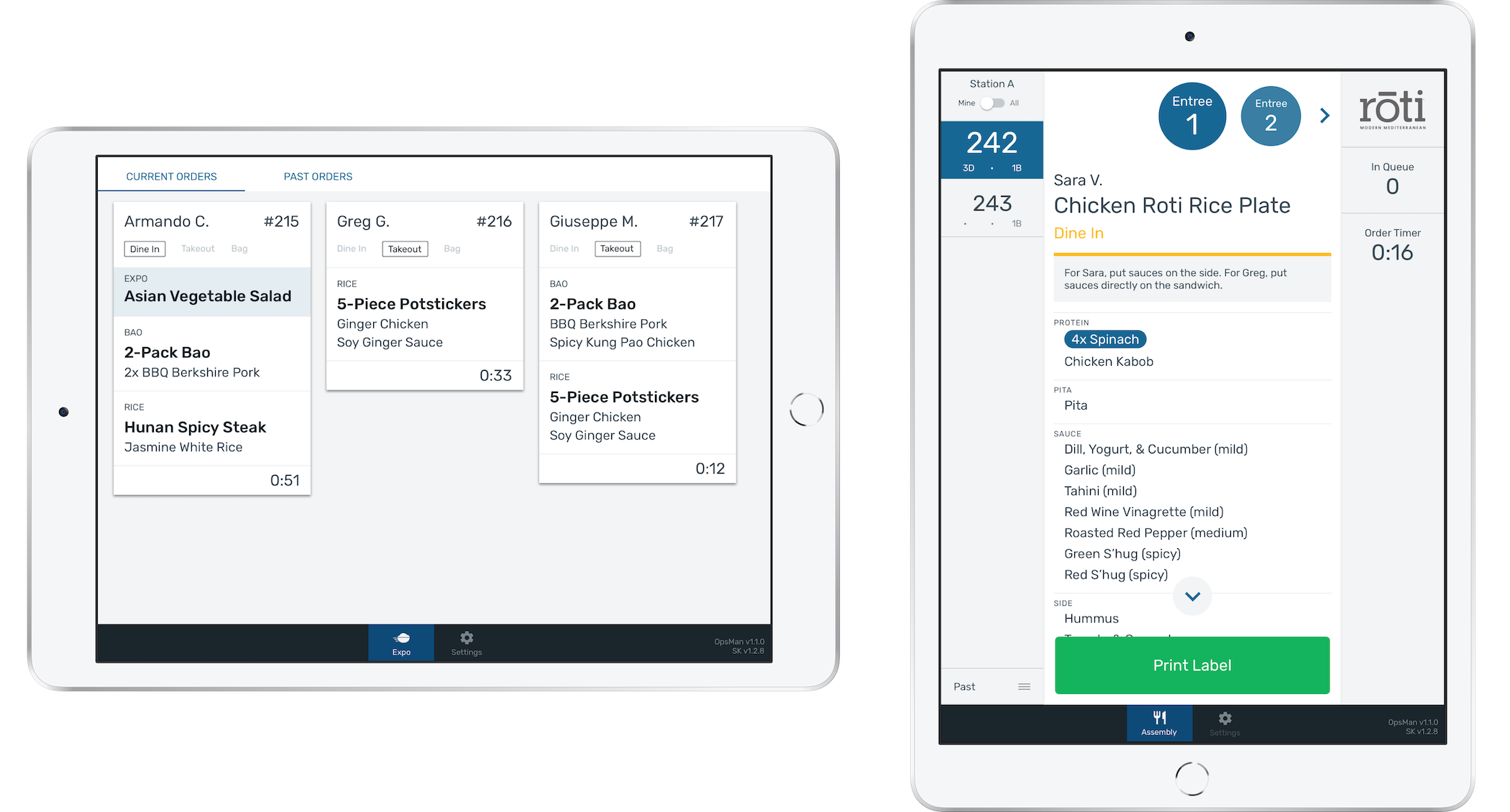
There are two different visual configurations for fulfillment: Tiles View and Carousel View. The two views exist to support differences in restaurant menus and back of house operational set-ups. A restaurant can deploy the same view to all stations or have a combination of the two views in their kitchen.
Stocks View
Host View
Pickup View
← →This case study will focus on Tiles View, one of the two Fulfillment Views. If you’d like to learn more about the rest of the OpsMan platform, feel free to reach out!
MY ROLE
As the lead designer of the OpsMan platform, I worked on all products end-to-end. I collaborated with Product to define our product requirements, led user research, designed in all stages, led cross-functional design reviews, worked with engineers through design QA, and visited our partners after deployment to assess the success of our products in-field.
BECOMING OUR CUSTOMER
It should come as no surprise that designing software to be used in a restaurant kitchen differs in many ways from building a consumer app. Understanding our customer, the environment they work in, and the unique challenges they face was especially crucial to arriving at a solution that increases speed and accuracy.
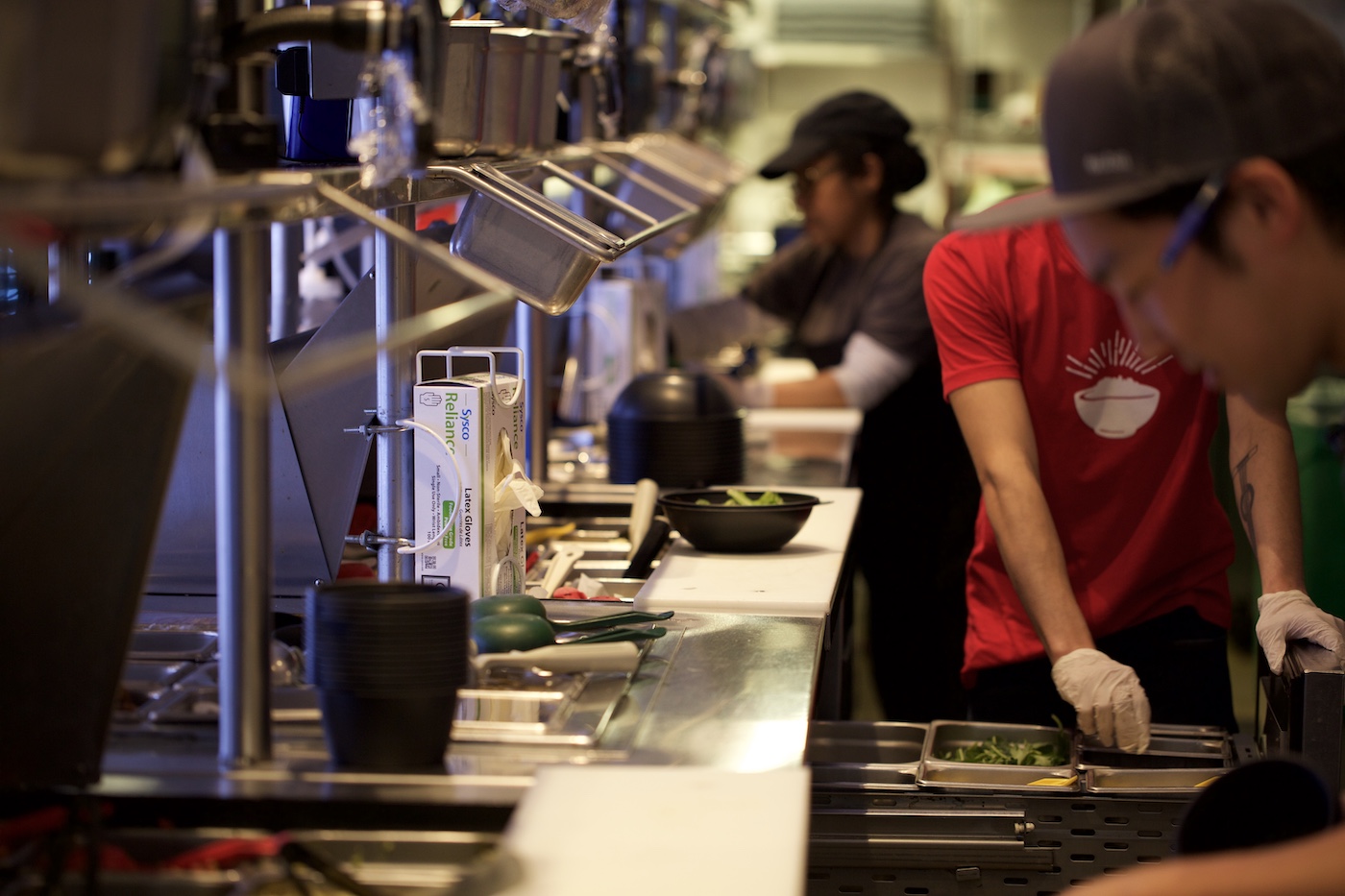
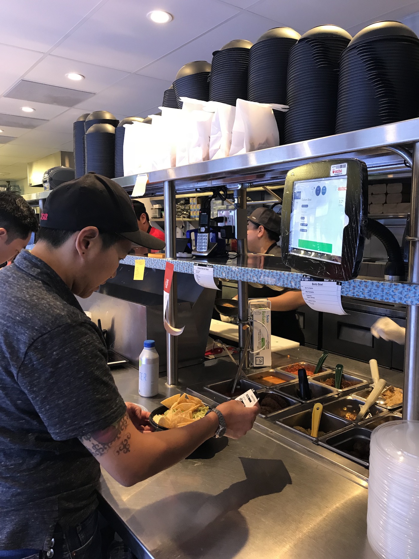
Becoming your customer is the best way to understand your customer. We worked friday lunch shifts at the original eatsa restaurants in downtown SF for a few months. You might have eaten a quinoa bowl made by me!
← →From this immersive research process and 8+ additional interviews from other back of house operators, we derived the following insights which played significant roles in the product definition and design phases.
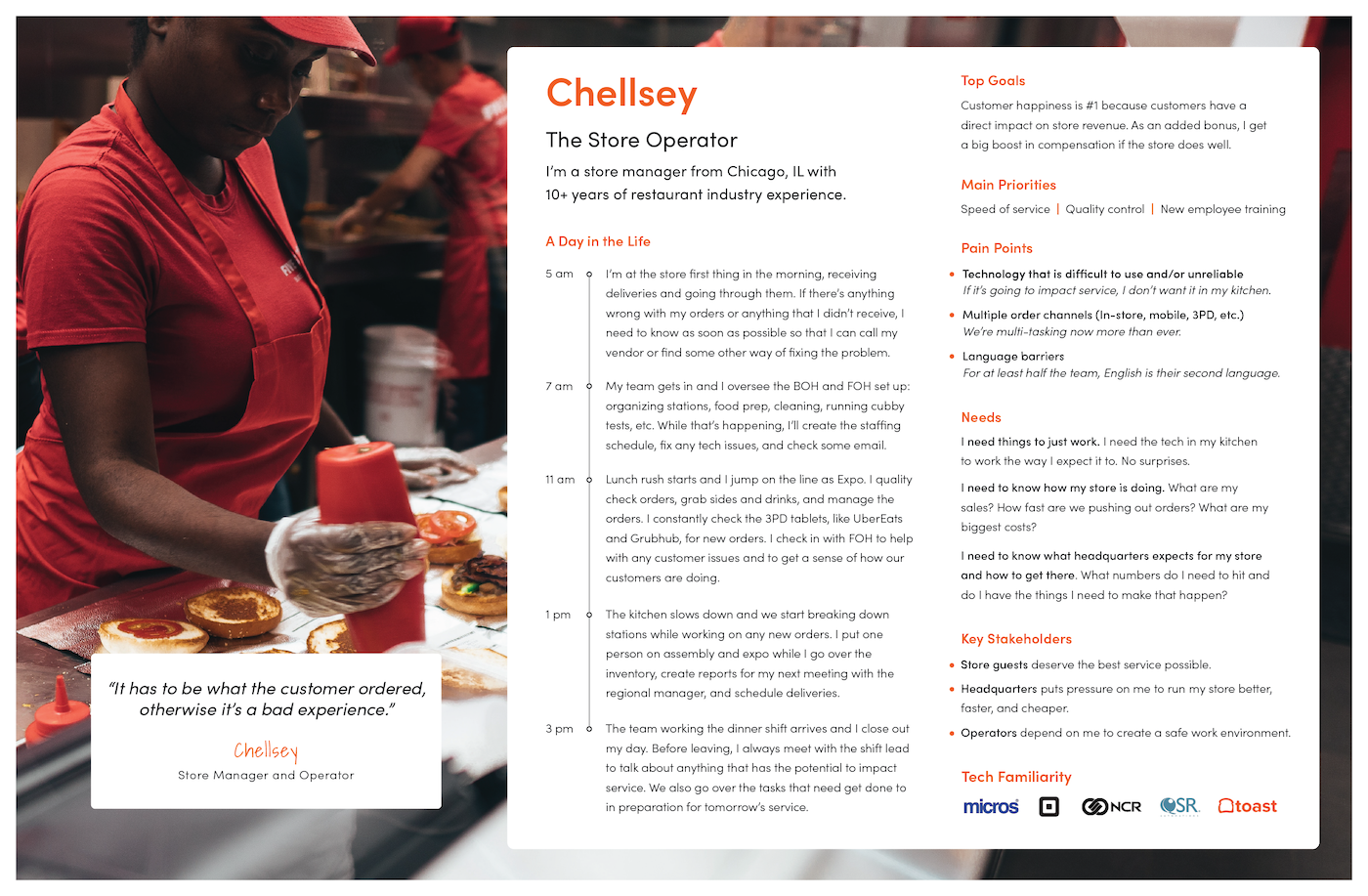
Operators are largely evaluated on how quickly they can push food out of the kitchen and are thus terrified of getting swamped with orders faster than they can complete them.
Constant Multi-tasking/Re-prioritizing:Employees are always performing more than one task at a time and need to be savvy about the order in which they complete tasks in order to stay ahead.
Clarity of Design:The kitchen is a brutal environment - hot, cramped, loud, and chaotic. Things need to be as clear and obvious as possible to rise above all the noise.
DEFINING THE OPTIMAL WORKFLOW
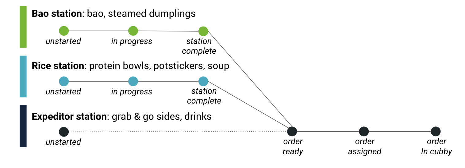
Tiles view accommodates the most common kitchen set-ups and operational workflows. This means having specific, filtered views for each supporting station and a complete, comprehensive view for any expediter (expo) stations. Configurable item routing lets operators see only what is relevant for them to do, which helps them focus and complete orders more efficiently.
All station views are linked, and the status of each station’s progress on an order is displayed in real-time to expo, who is in charge of collating orders and delivering them to customers.
EARLY CONCEPTS AND VALIDATION
I used a combination of whiteboard sketches, wireframes, and prototypes to validate product features and user interactions.
FEEDBACK AND ITERATIONS
In addition to regular cross-functional design reviews, we shared early prototypes with prospective customers to get feedback on features and user interactions.
We received positive feedback around the direction as a whole, with particular enthusiasm about the following:
Limited physical screen interaction - Operators hands are busy making and handling food. The fact that interactions with the screen consist of just a few simple taps was appreciated.
Clarity of design - It was easy to digest information due to the strong visual hierarchy.
Real-time visual updates - The orders on the expo’s screen update when a supporting station has finished items for an order. This eliminated verbal communication and confusion between stations about the status of an order.
Masonry style layout - Operators appreciated the masonry style layout because it meant that they could see more orders at a time and batch similar orders.
Two areas of opportunity that made an especially large impact on the user experience and overall design direction were:
"In general things need to be way more aggressive and in your
face."
Many operators insisted that the state of orders needed to be more
obviously communicated. Particular care should be given to orders that
are taking too long to complete and orders that are ready to be
delivered. Given that there are so many things an operator is doing in
a kitchen, the most urgent tasks need to be communicated so obviously
that someone can’t miss it.
"We are all very visual but symbols and icons leave too much room for
interpretation. They aren't universal enough to communicate information
without prior instruction."
In my prototype I used a checkmark symbol to indicate that items in
those orders were completed but many operators noted that this is was
unclear and that iconography in general was a bad practice in the
kitchen environment. Operators preferred that we use traffic light
colors (green, red, or yellow) or simply use text.
These two pieces of feedback were especially influential in our decision to use strong color treatments throughout Tiles View.
HIGH-IMPACT DESIGN AND PRODUCT FEATURES
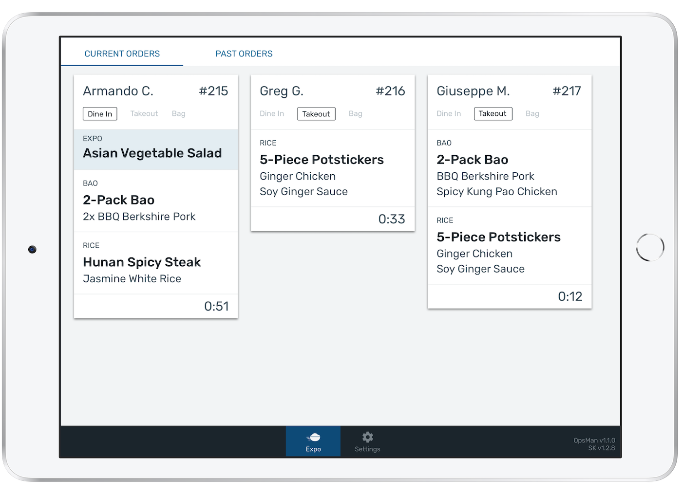
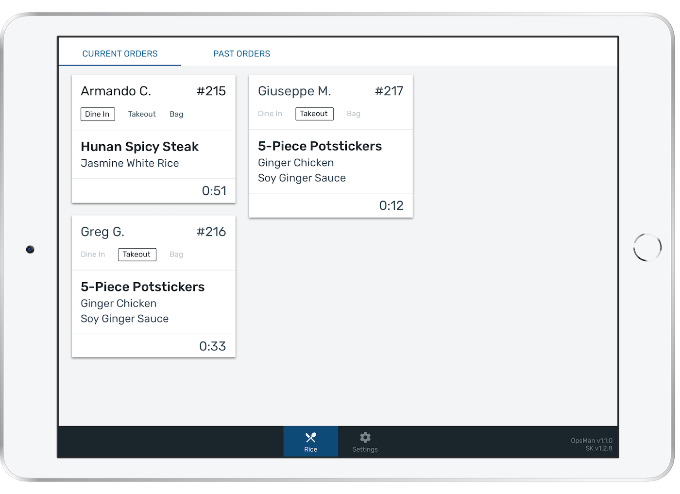
Filtered display for supporting stations vs. comprehensive display for expo
By showing operators ONLY what is relevant to them in an order, each station spends less time thinking and can send their food to expo faster.
Expo station view
Supporting station view
← →Completable Orders and Location Assignment
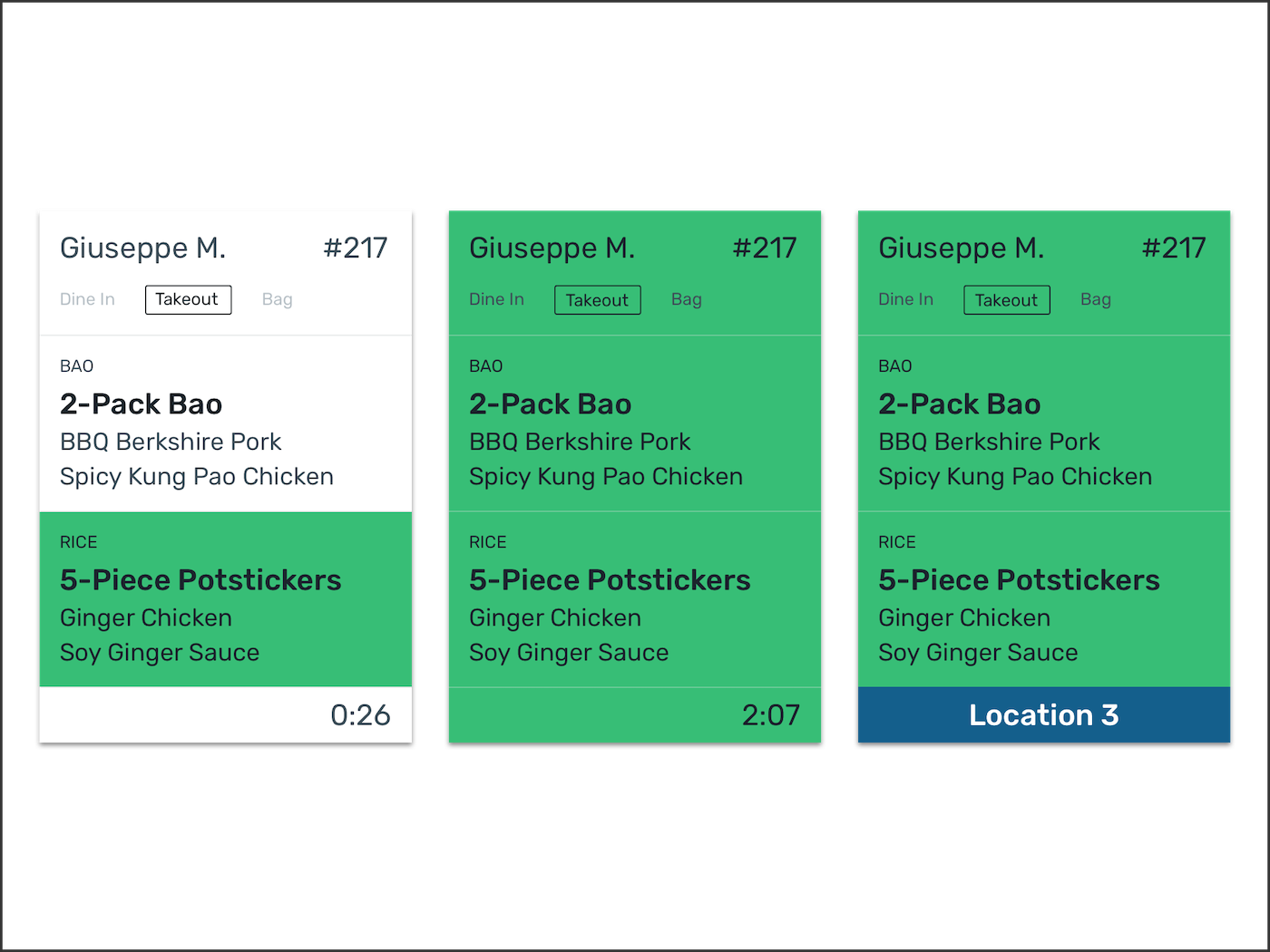
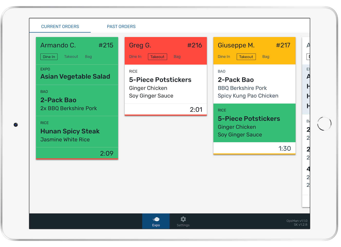
To reduce cognitive load on expo, sections of orders are highlighted in green as supporting stations complete their tasks related to that order. This provides a sense of the pace of the kitchen and helps expo know what they still need to complete an order.
When the entire order turns green, expo knows that they have received everything in a customer’s order and can mark it as complete.
While the green is an aggressive styling treatment, we took operator feedback to heart about making things "in your face" and "obvious." Operators love the all green card because it is the clearest signal to them to get that order out of the kitchen. This especially comes in handy when an operator is not right in front of a screen but can see a huge wash of green out of the corner of their eye.
Colors Tied to Order Time
Food needs to leave the kitchen as fast as possible and most restaurants provide their operators with guidelines for what constitutes acceptable and unacceptable fulfillment times (e.g. Under 2 minutes is acceptable, over 2 minutes is not).
In an effort to make this information explicit, we use colors like a traffic light (red, yellow, green) to communicate the status of an order. Each restaurant partner is able to configure these colors to correspond to their unique time thresholds.
Workflow Organization and Data Tracking
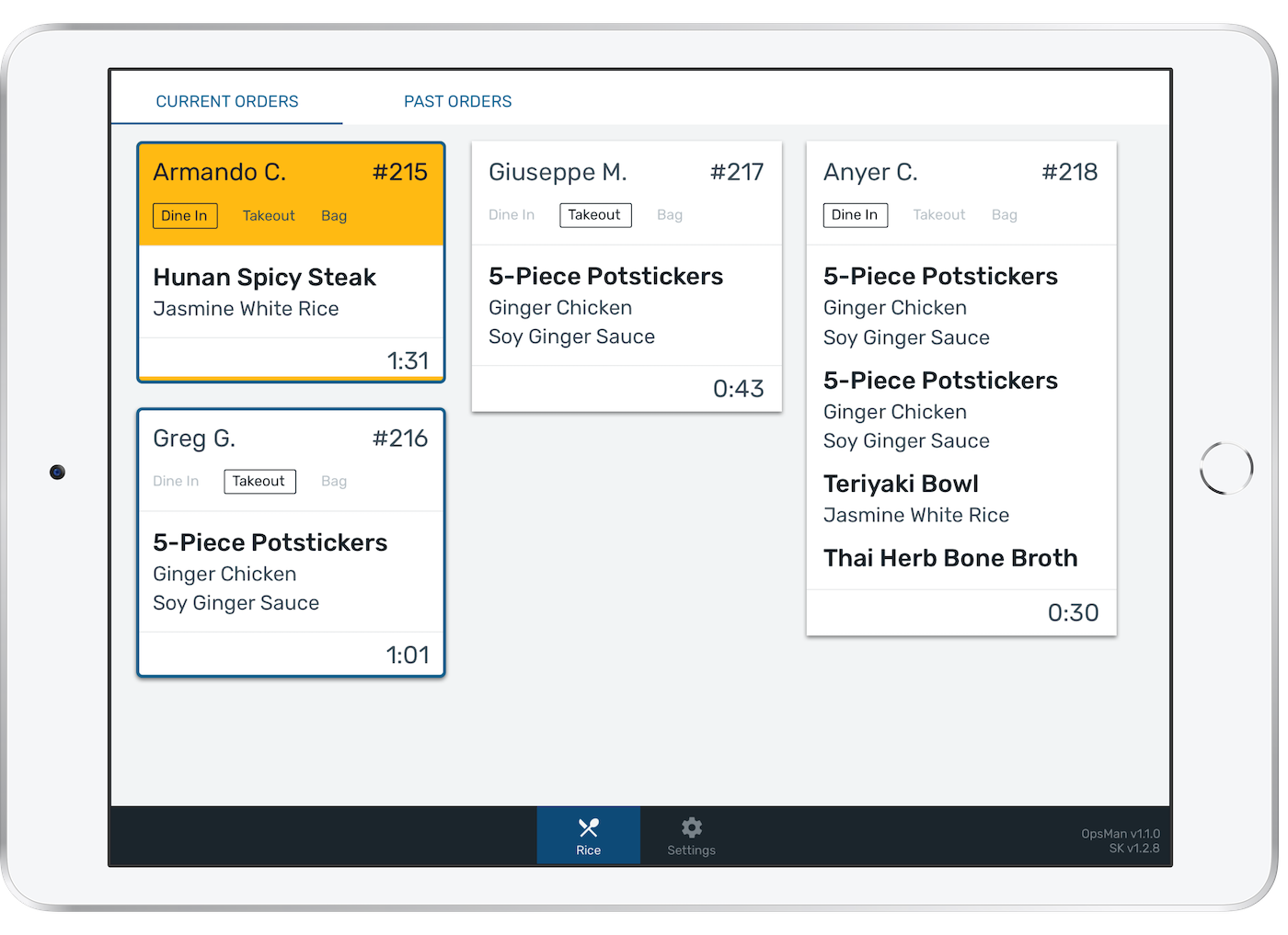
Because operators are constantly multitasking and working on multiple orders at a time, it can be hard to remember which orders you have started and which you haven’t. Operators tap orders once to mark them as in progress (blue outline) and again to mark them as complete.
These screen interactions serve a secondary purpose: they let restaurants know how quickly food is leaving the kitchen. The time between taps is recorded to identify inefficiencies. Our restaurant partners get a breakdown of the average time each supporting station takes to complete items and the total time it takes orders end-to-end.
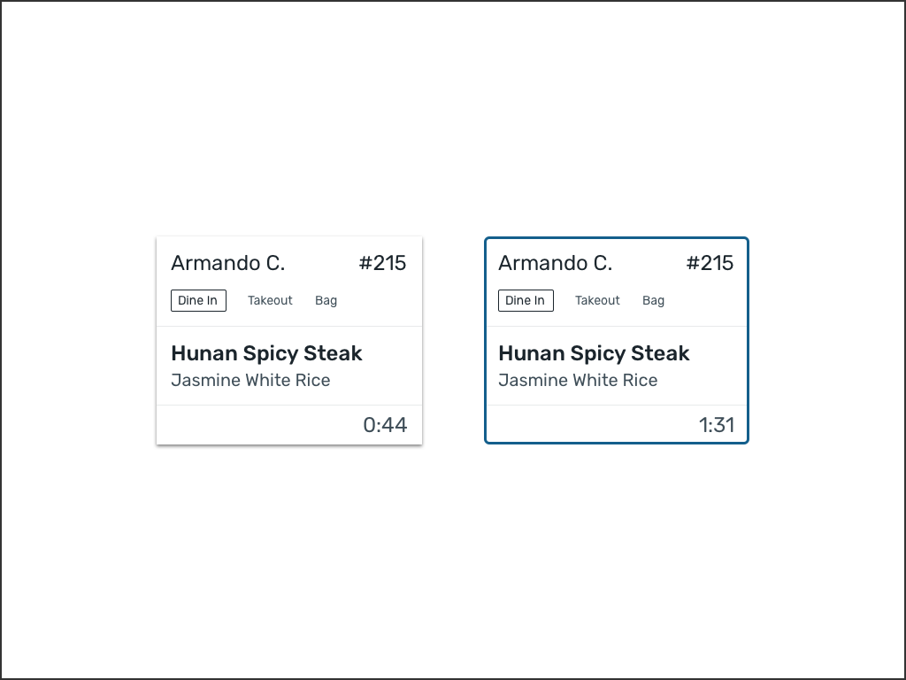
Unstarted order vs. an order that has been started by a supporting station
An example supporting station screen where some orders are in progress (blue outline) and some are unstarted.
← →DELIVERY, IMPACT, AND FEEDBACK
We visited our restaurant partners to solicit feedback and understand how they used the product.
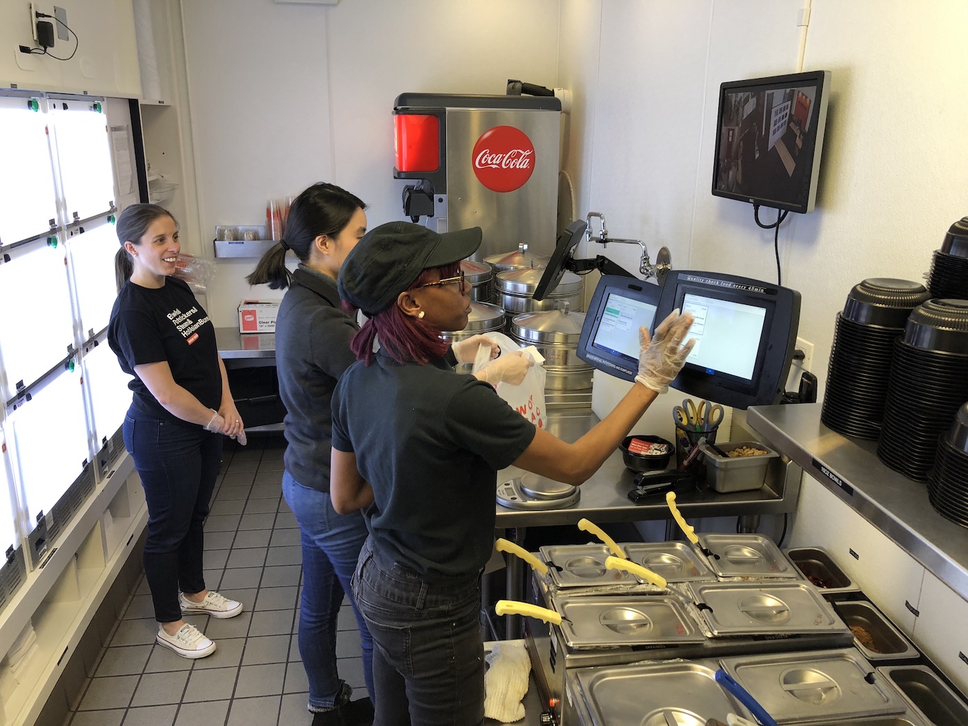
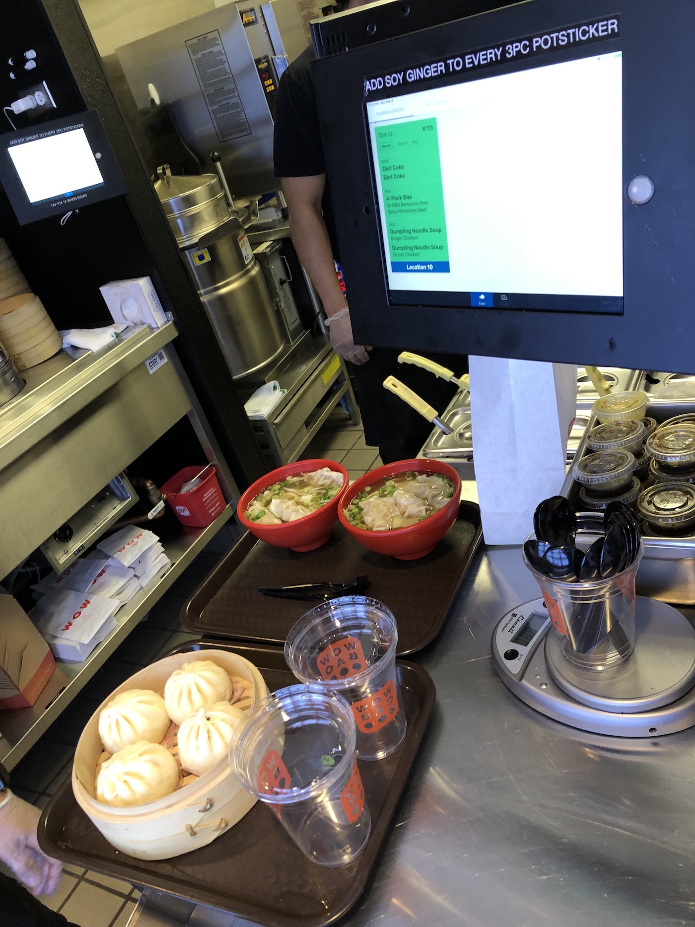
Back-of-house at Wow Bao in Chicago, IL with operators using tiles view.
← →Feedback overall has been very positive. Our partners report that little to no training is necessary. Tiles view is intuitive enough so that most operators feel comfortable using it after a few minutes. It has been rolled out to 40+ restaurant locations worldwide and our partners have reported significant improvements to operational efficiency and speed.
