Odd Folk Films
THE SITUATION
Once upon a time, a quirky group of film-loving friends decided to start producing their own original video content. Odd Folk Films (OFF) needed an internet presence to share their work and to welcome other aspiring filmmakers to join their crew. My goal was to create a brand that captured that feeling of being a little... off.
THE SOLUTION
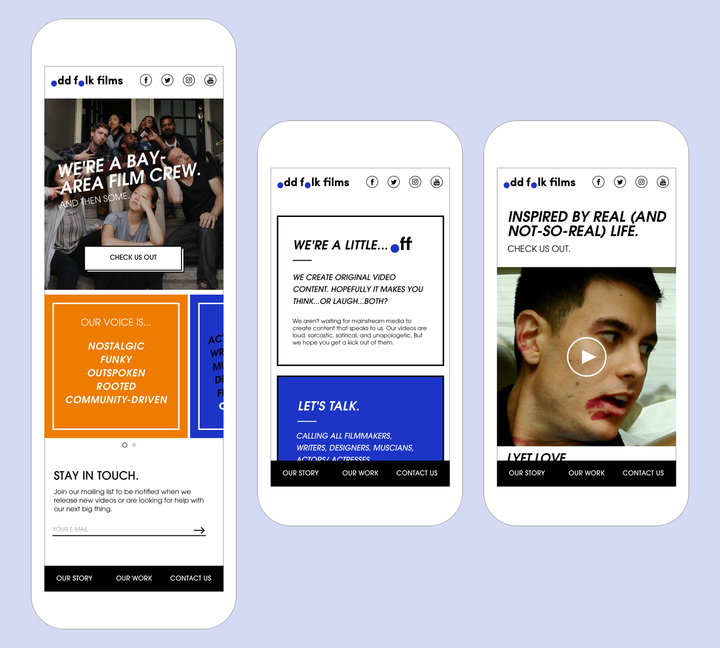
The Odd Folk Films approach is bold and cheeky, yet very self-aware. Building on top of the existing logo, I infused all aspects of the brand with a unique visual and verbal language - an energetic color palette, in-your-face copy, and nostalgic interactions. All these elements resulted in a responsive website that is equal parts playful and welcoming.
MY ROLE
Research - UX/UI Design - Visual Design - Brand Messaging/Identity - Copywriting
Discovery - Uncovering the OFF Identity
I began the discovery/research phase of this project by conducting a few initiatives:
- Identifying OFF's goals for the web and mobile sites
- Understanding Odd Folk Film's personality
- Examining the digital presences of other video production companies
THE GOALS
Odd Folk Films had three primary goals for their web and mobile sites: to showcase their work, be a digital representation of their brand, and invite other aspiring filmmakers to join the group.
WHO IS ODD FOLK FILMS?
"As a brand... we are HBO, not ABC."
The OFF community is made up of filmmakers from diverse backgrounds and experiences who are united by their love of creating visual media. After interviewing the members of OFF and going through a detailed creative brief together, I nailed down 5 keywords that captured the group's spirit.
Nostalgic, Funky, Outspoken, Rooted, and Community-Driven
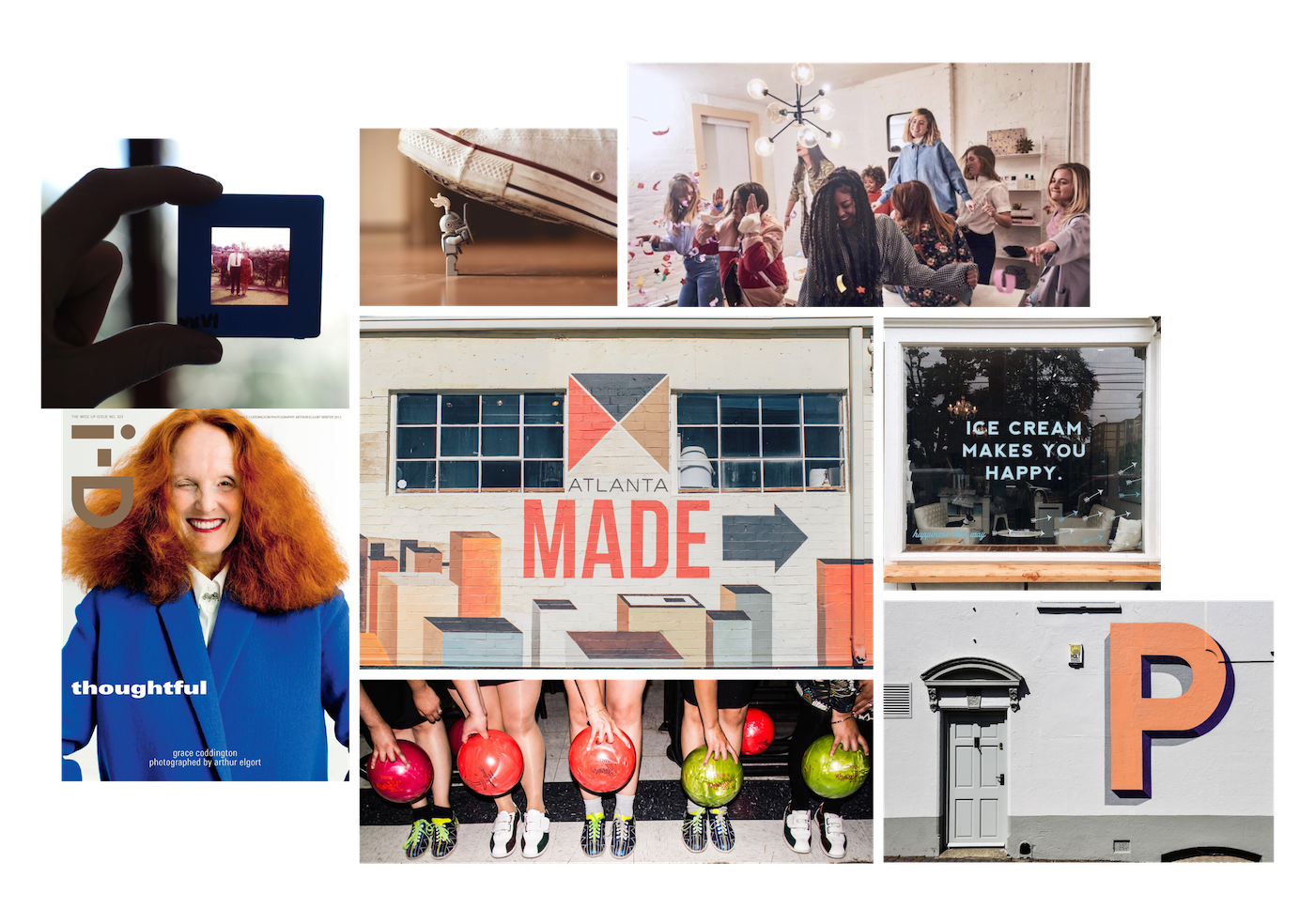
Based on these keywords, I created a mood board to help visualize the brand and to provide inspiration for the design phase.
COMPETITIVE LANDSCAPE
After getting a sense of what makes Odd Folk Films special, I studied a few competitors' sites. The goal of this exercise was to understand how other companies in the film industry express themselves digitally and what learnings I might be able to incorporate into the OFF site.
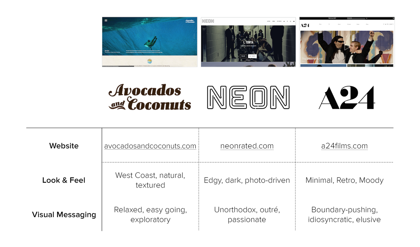
The main insights from this process were:
Heavy use of photography, minimal use of text, and a primarily black and white color palette.
Grid-based layout.A grid layout was common among sites I examined. The grid structure seems an effective way of separating and organizing information - I eventually adopted a similar layout to the OFF site.
Lack of strong copywriting.I chose to focus heavily on copywriting after reviewing other sites. There is little text on most of the competitors' sites and what little text does exist reads as generic and obvious.
Design - Putting the Quirk to Work
PAPER SKETCHES + LOW-FIDELITY WIREFRAMES
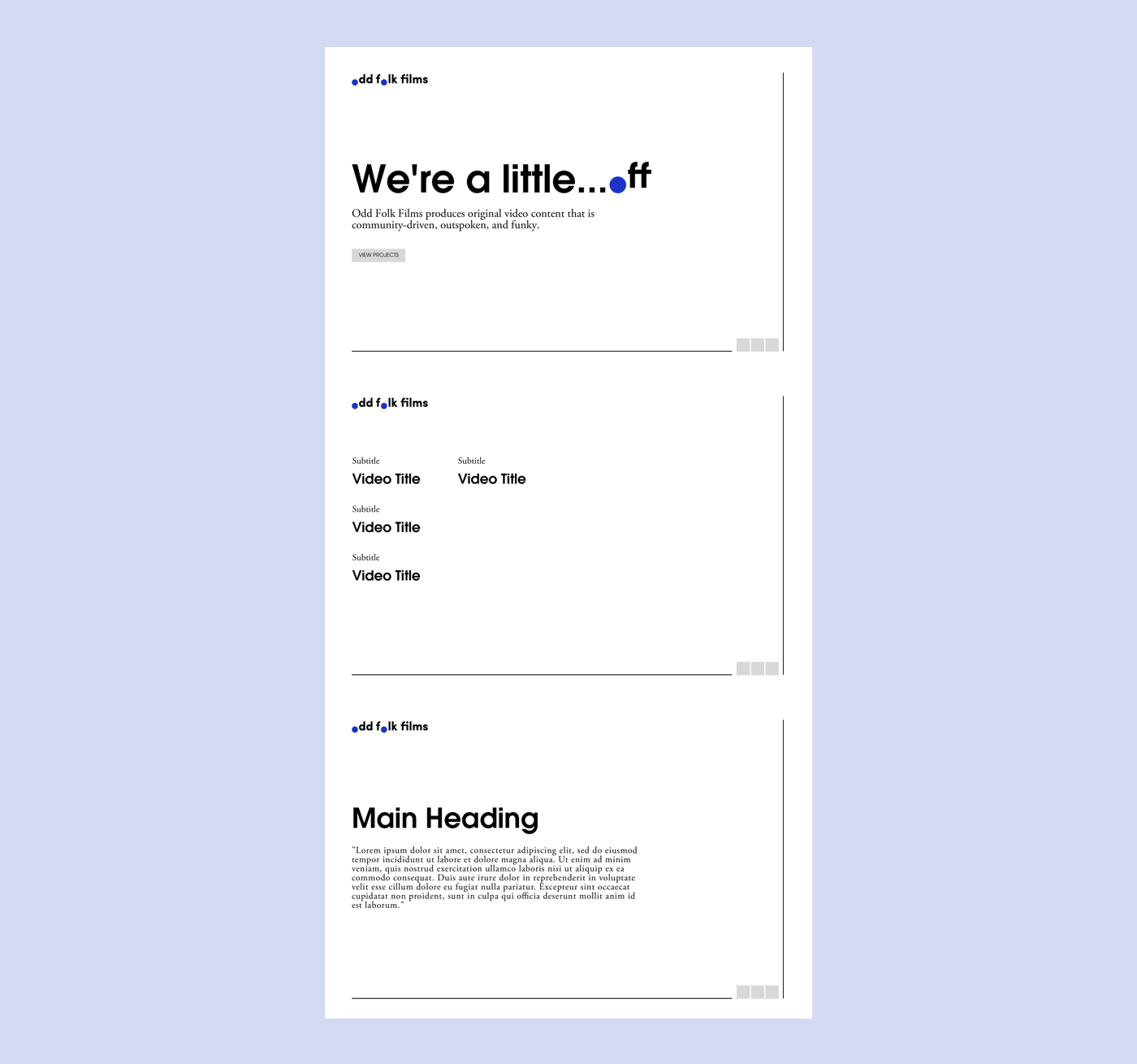
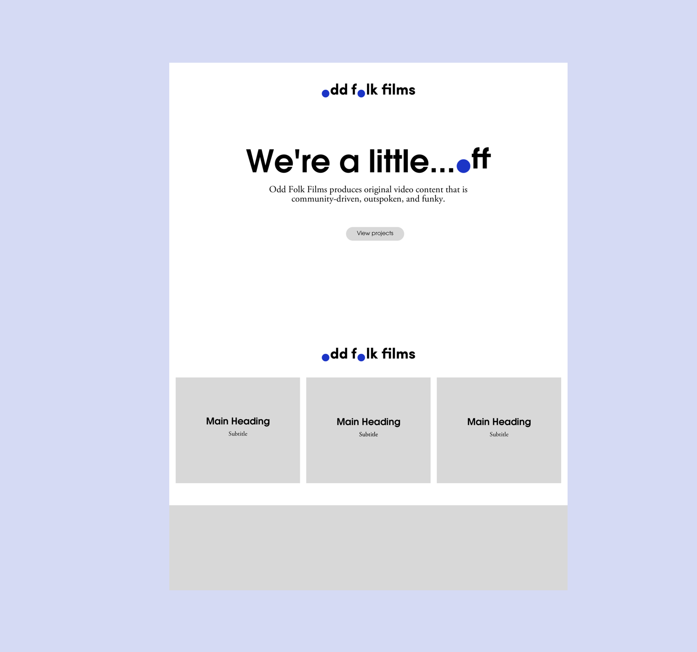
Full of inspiration, I started sketching rough wireframes of the site on paper and then moved my wireframes into Sketch. I created three initial concepts and shared them with the client. Unfortunately, the team didn't completely resonate with these first three concepts.
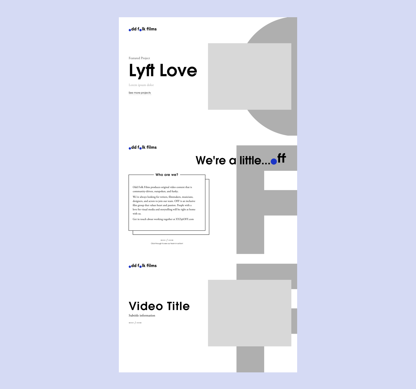
I personified the letters comprising the Odd Folk Films acronym, OFF, and set them a bit off the page. This idea was not readily grasped by the team and the long-scroll format of this site design would only complicate this concept.
There was not enough video content from the OFF team to make the most of the concept.
The concept seemed too familiar and ordinary - there are too many sites that are also laid out in this format.
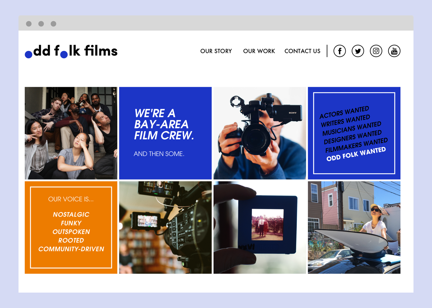
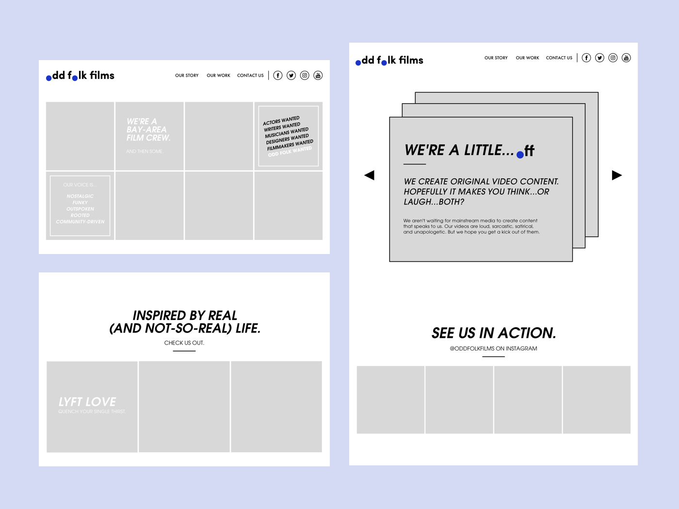
← →No worries - back to the drawing board! I focused on combining aspects that the client liked from the first set of concepts and zeroed in on two of the keywords: nostalgic and funky. The idea was to create a retro feel with grid-based tiles and large blocks of colors.
Bucking the dark and moody trend I saw everywhere on competitors' sites, I created a layout that felt raw and vaguely old-school - minimal photography and lots of emphasis on strong colors and geometric shapes.
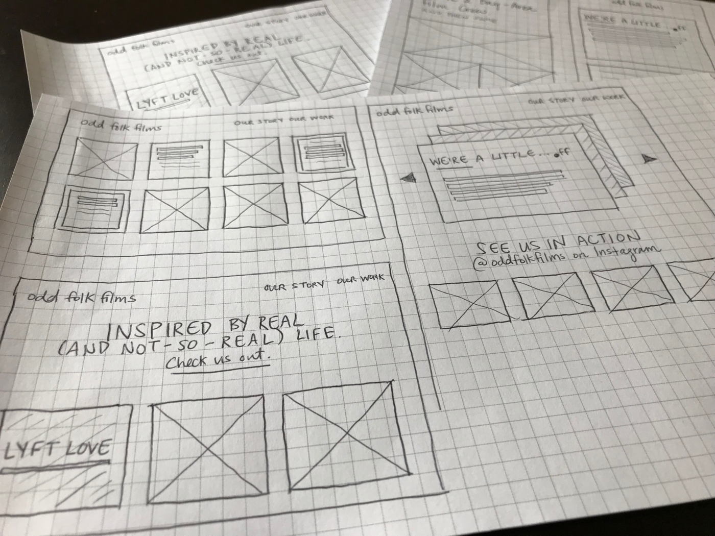
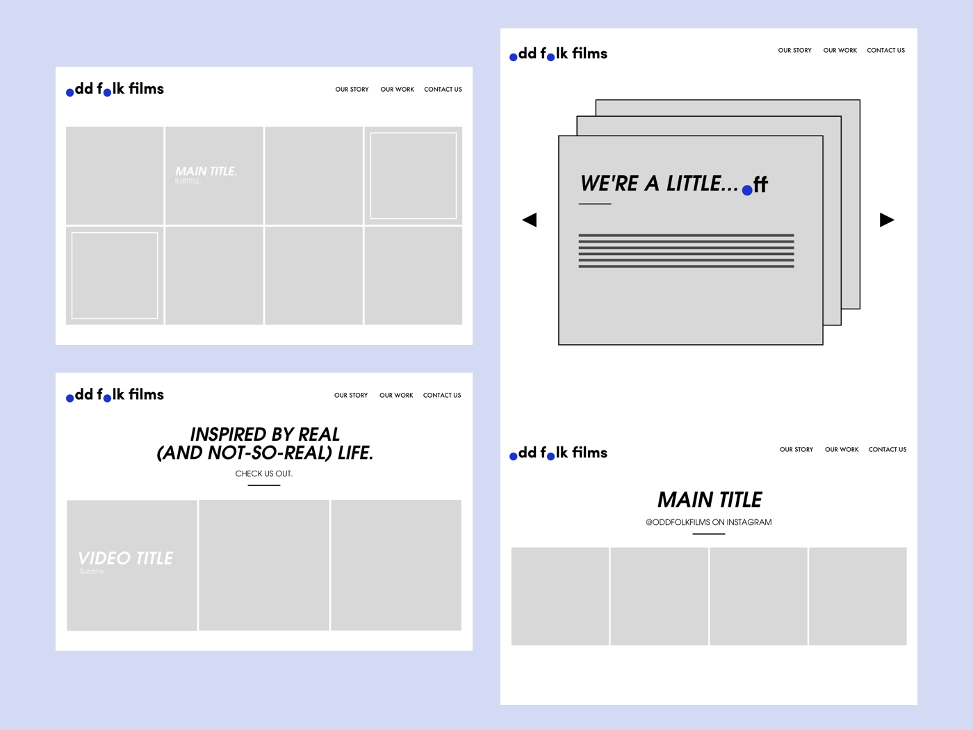
Paper sketches of the new designs
Low-fidelity wireframes of the new site design
Playing with type and adding in snippets of copy
← →COLOR
It was important to choose colors that were striking individually and together, embodying the idea that the larger group, as well as each individual member, has a voice.
Strange but true - my inspiration for this color pairing came from this i-D cover of Grace Coddington. Her fiery, burnt orange hair against her bright, blue jacket really struck me!
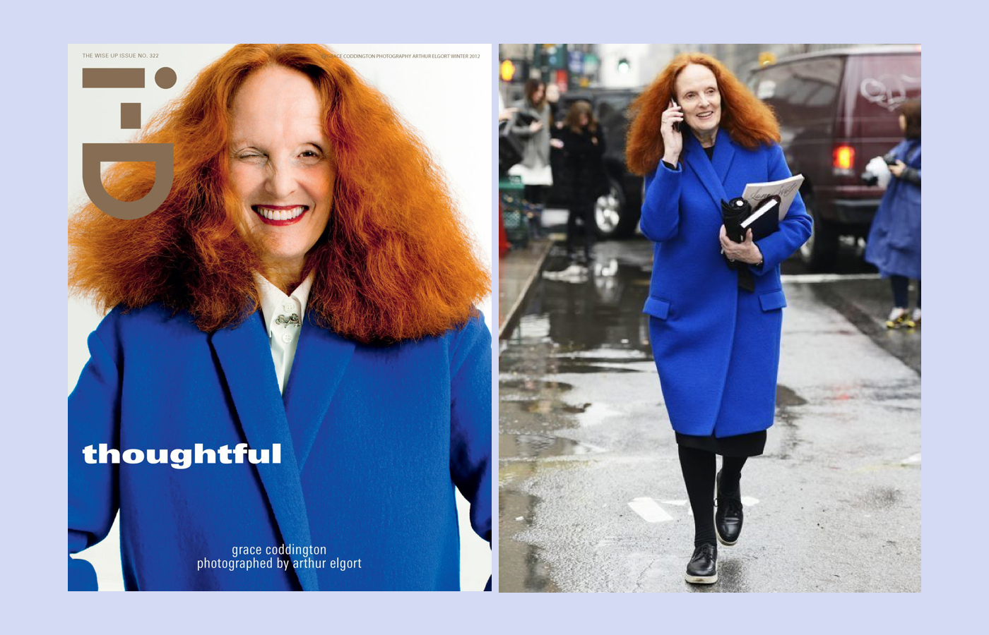
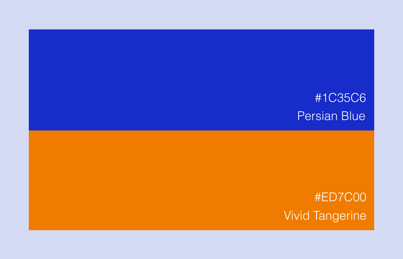
An electric blue and a vibrant orange seemed an unlikely pairing that ended up perfectly complimenting yet contrasting each other - much like the members of OFF!
Final colors
← →TYPOGRAPHY
To keep the typography in line with the rest of the visual style, it was natural to choose a more unconventional typeface. But since there were already so many other loud stylistic elements, I didn't want the site to feel overwhelming. I chose only one typeface for the whole site and utilized varying weights and sizes to introduce hierarchy.
The final site is set in ITC Avant Garde Gothic Pro, a geometric sans serif font that is rooted in circular shapes and straight lines. An eccentric font due to its unique alternates and ligatures, this font is well suited for the site's bold headlines and short bursts of body copy.
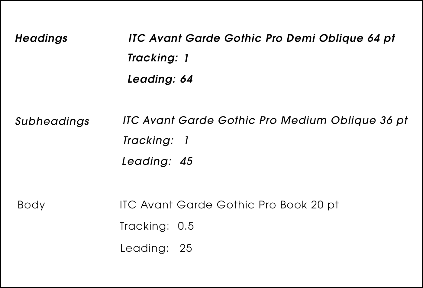
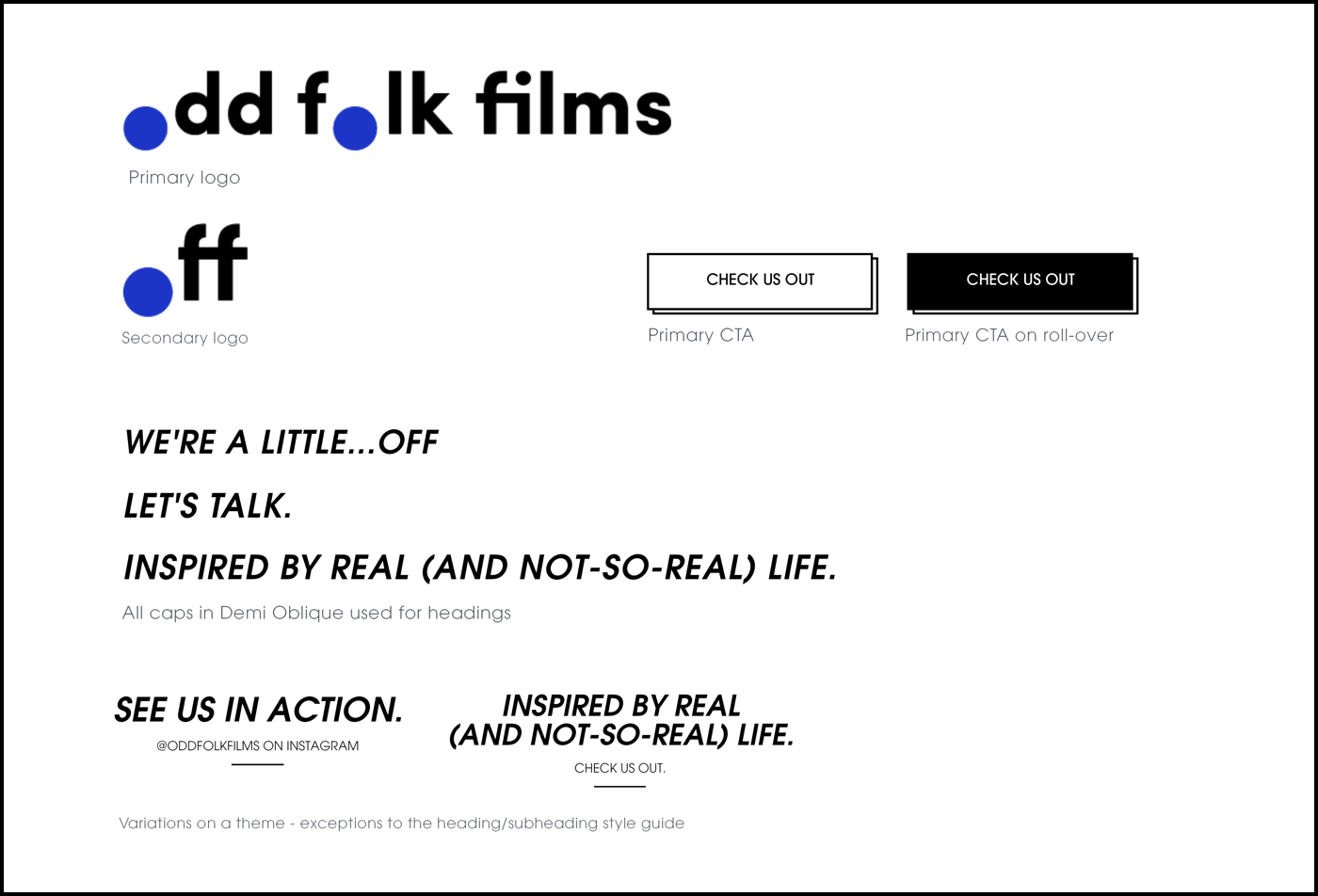
Final type guide
A snippet of the style guide
← →A Bay-Area Film Crew. And Then Some.
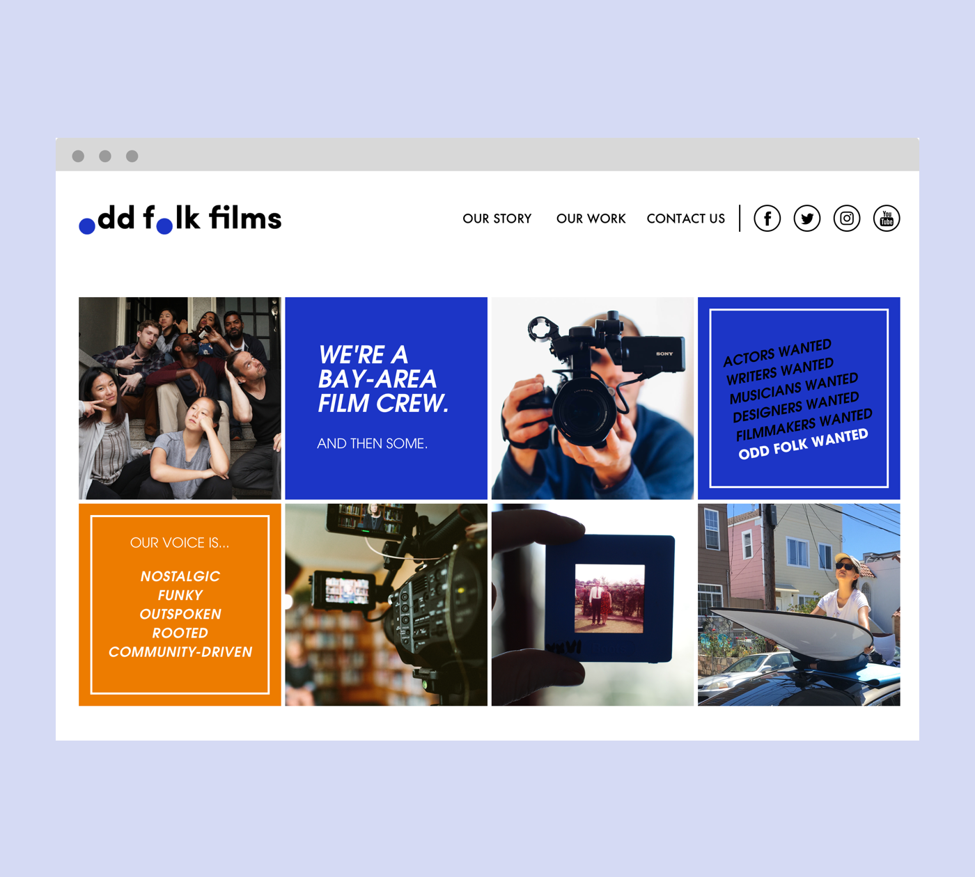
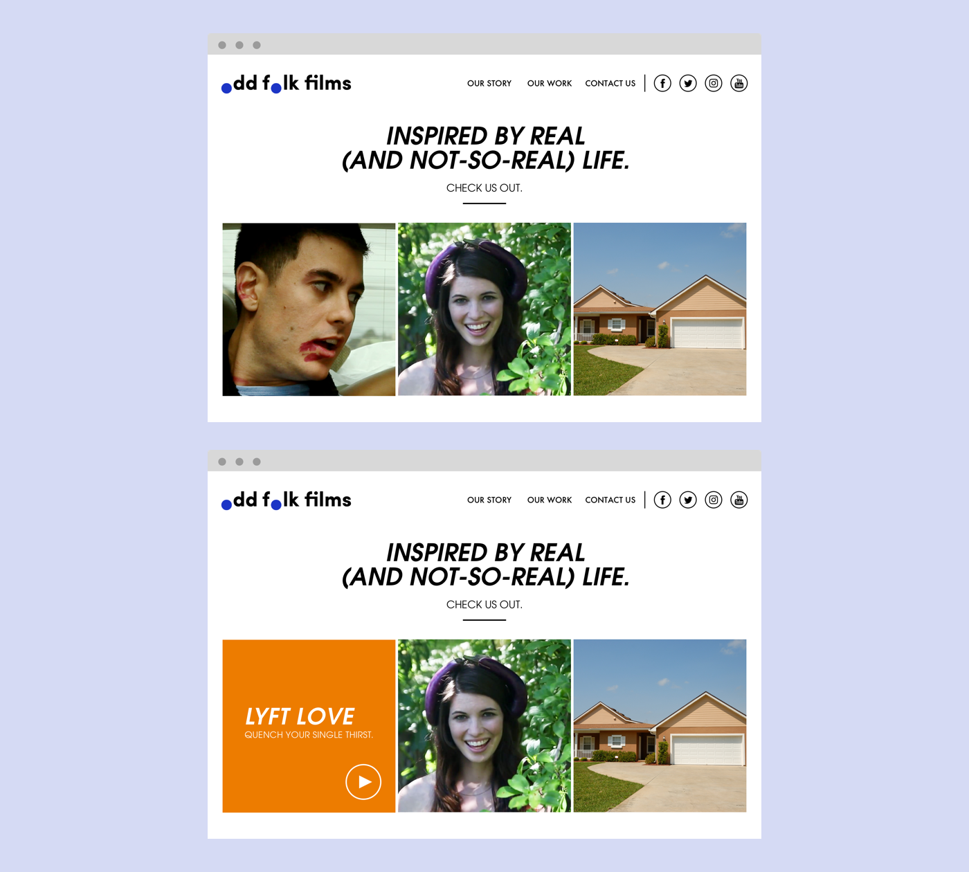
Desktop home page
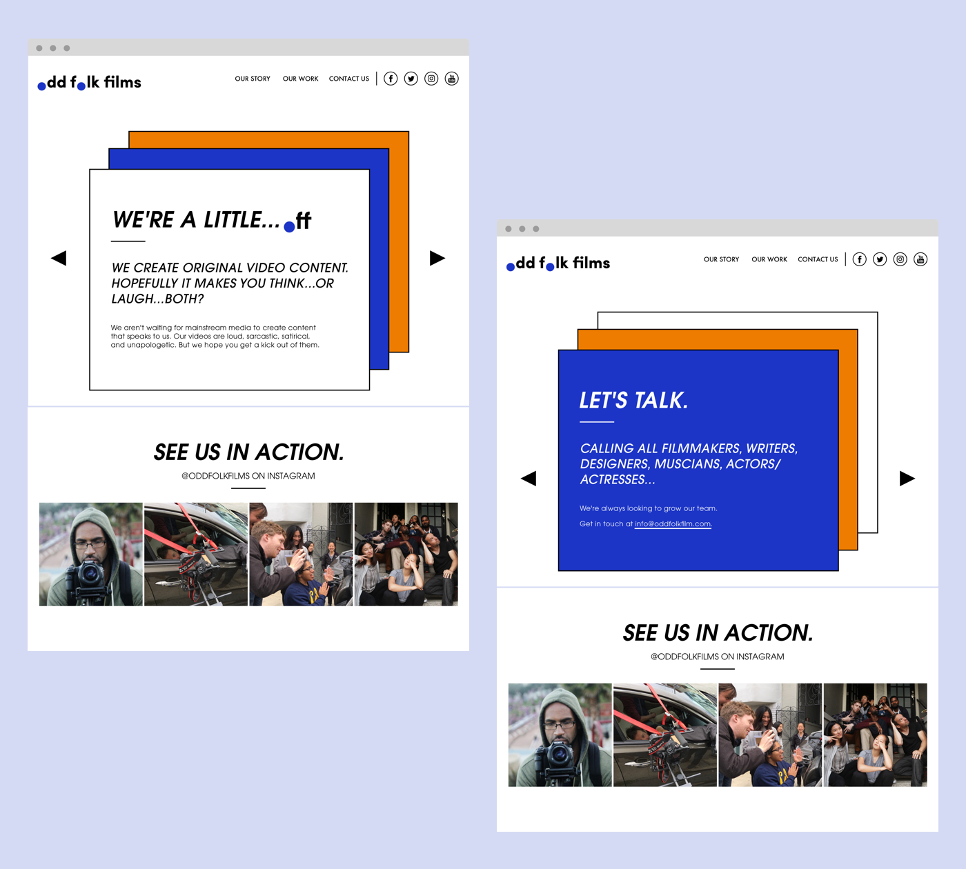
Desktop about page. Right hand side displays the second layer in the carousel.
Desktop work page. Lower screen displays the hover state.
← →