Visa Banking Chatbot
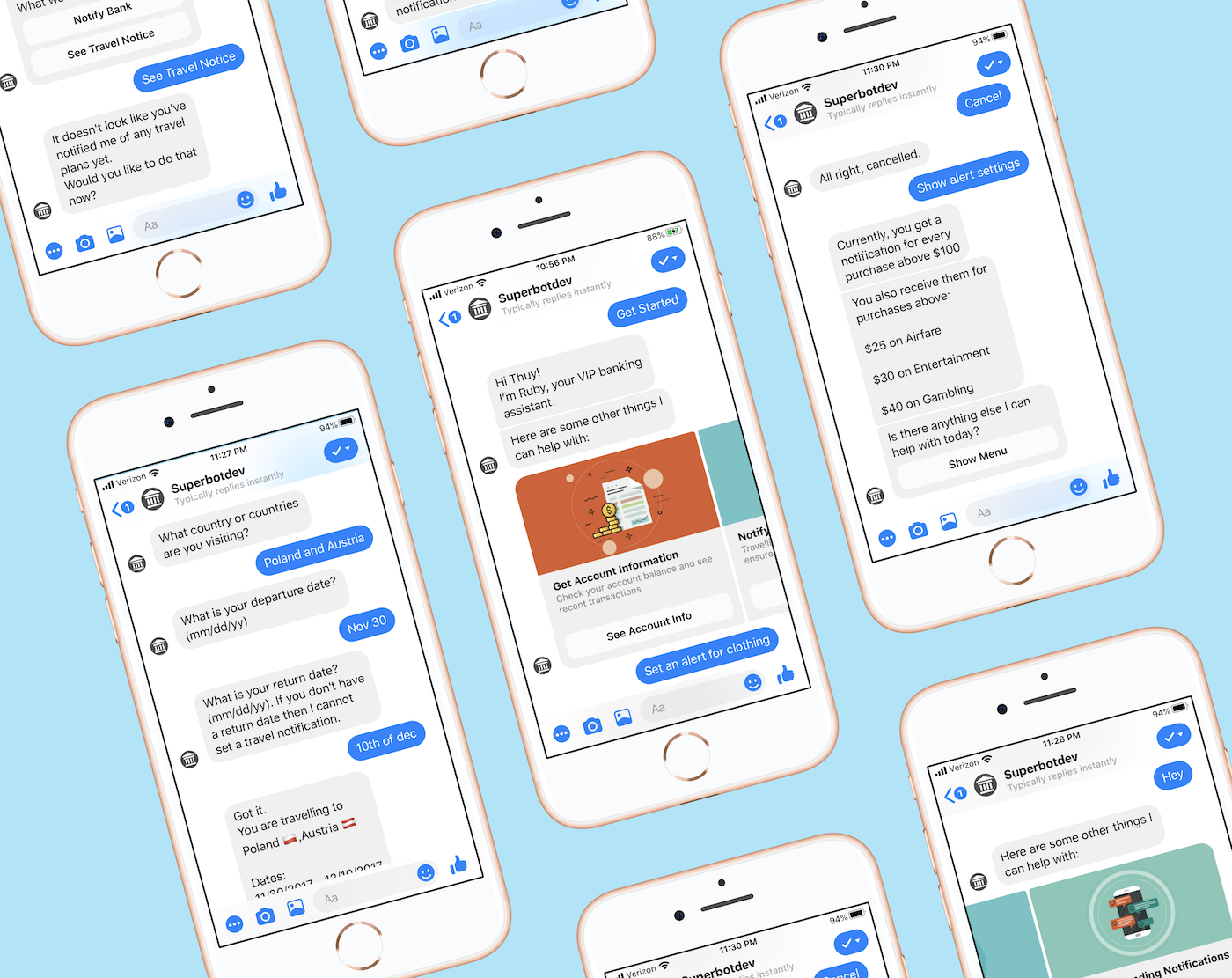
Note: For privacy, the client’s name will not be mentioned and I have omitted and obfuscated confidential information. All information in this case study does not necessarily reflect the views of Visa.
THE SITUATION AND SOLUTION
Financial institutions worldwide struggle to engage their millennial customers.
A client came to the Innovation Center with existing digital resources (website and mobile app) but saw very little web traffic and app downloads. In the hopes of providing a more effective channel to connect with their millennial customers, we worked together with our client to develop a banking chatbot focused on monitoring credit card spend and setting up travel alerts.
MY ROLE
I worked on a team with 2 other designers, leading efforts around defining the chatbot persona, designing the conversational flows, and testing the bot’s NLP with engineering.
UNDERSTANDING MILLENNIAL FINANCIAL NEEDS AND PERCEPTIONS AROUND CHATBOTS
We started the process by understanding user expectations for a financial services chatbot and how users perceive chatbots as being helpful resources.
From our research with users, we derived the following high level insights:
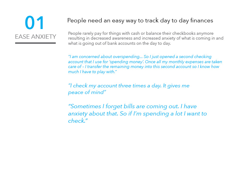
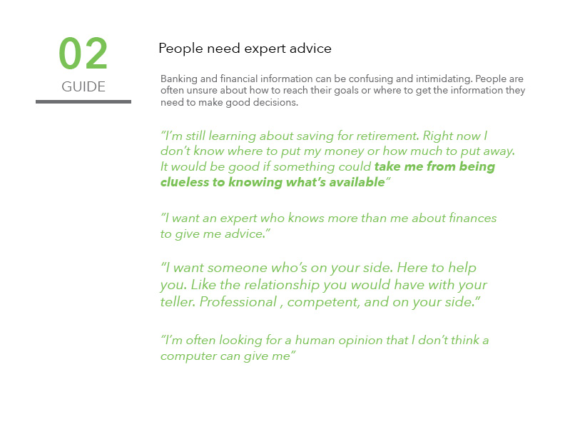
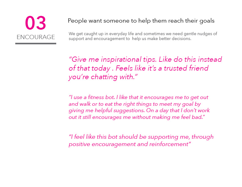
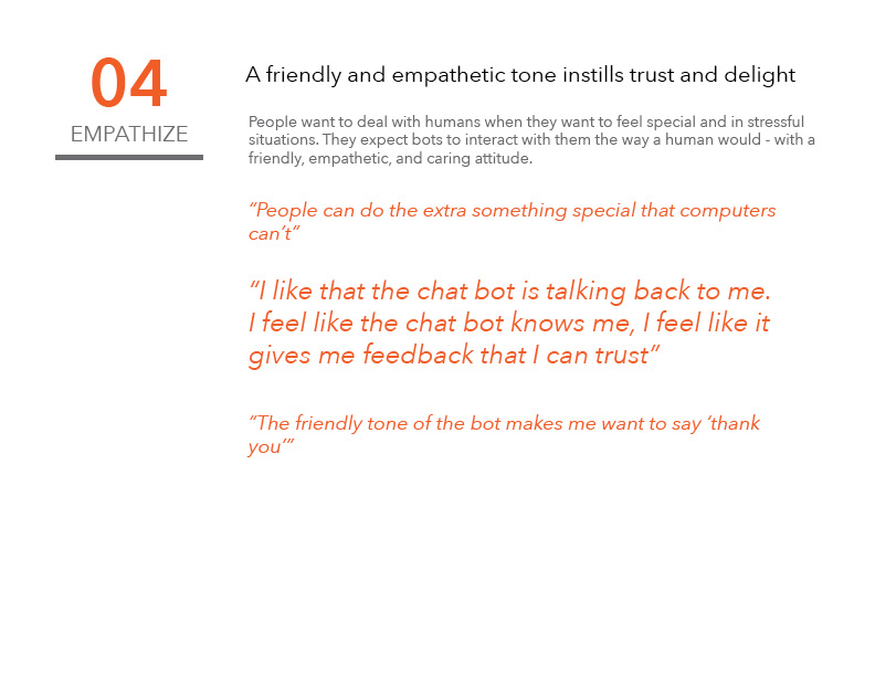
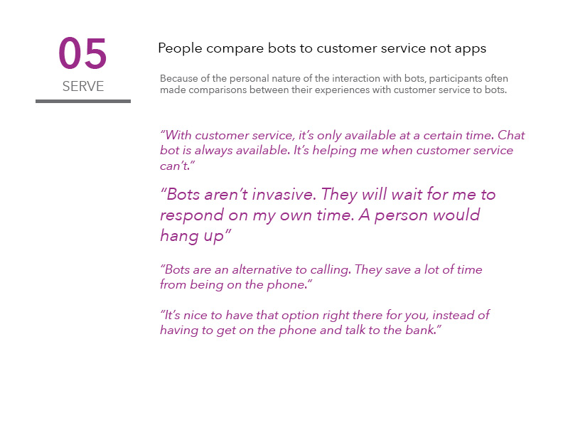
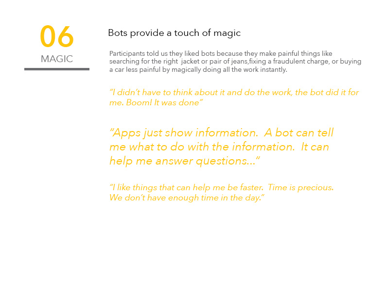
Using the feedback we heard from research participants, we decided to focus the chatbot on providing services around credit card monitoring and controls to help users continuously track their spending and quickly report fraudulent charges.
DEFINING VOICE AND TONE
A chatbot’s version of “look and feel” is voice and tone. The chatbot would be a digital representation of our client and needed to meet customer expectations of the client’s brand. We worked with our client to better understand their values as a company and to brainstorm ways we could infuse personality into the chatbot.
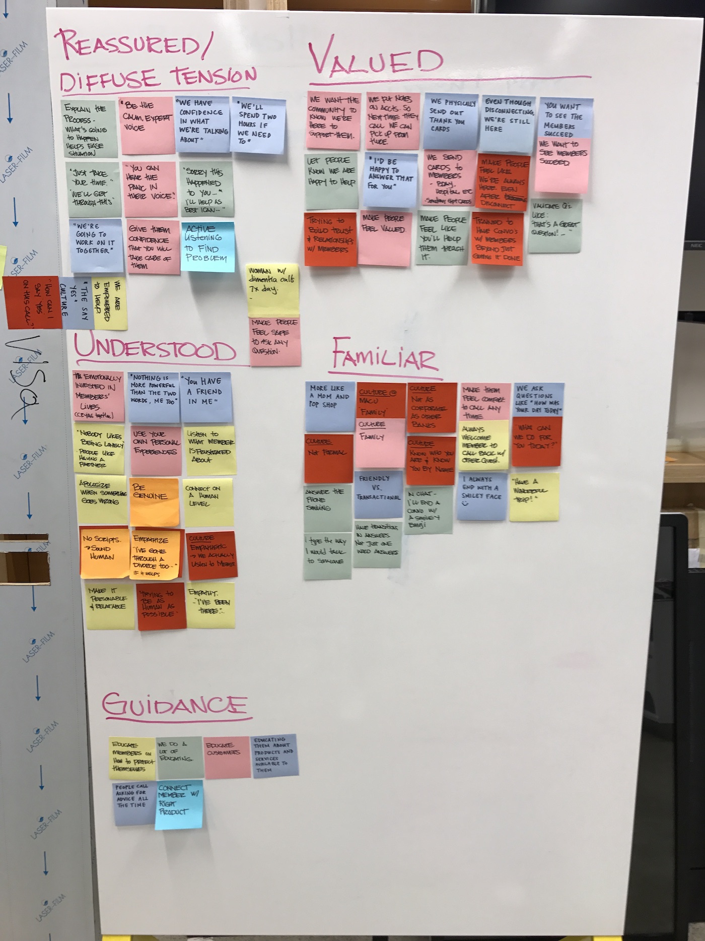
In particular, our client described themselves as being a "familiar face" and being experts at diffusing tension with customers.
During our research, users continuously brought up the desire for digital financial products to be empathetic and comforting while still being able to provide expert advice and solve problems. Combining these insights with our client’s brand attributes, we wove together aspects of Cinderella’s Fairy Godmother (loving, understanding, caring) and Warren Buffet (smart, trusted, reliable) to create Ruby.
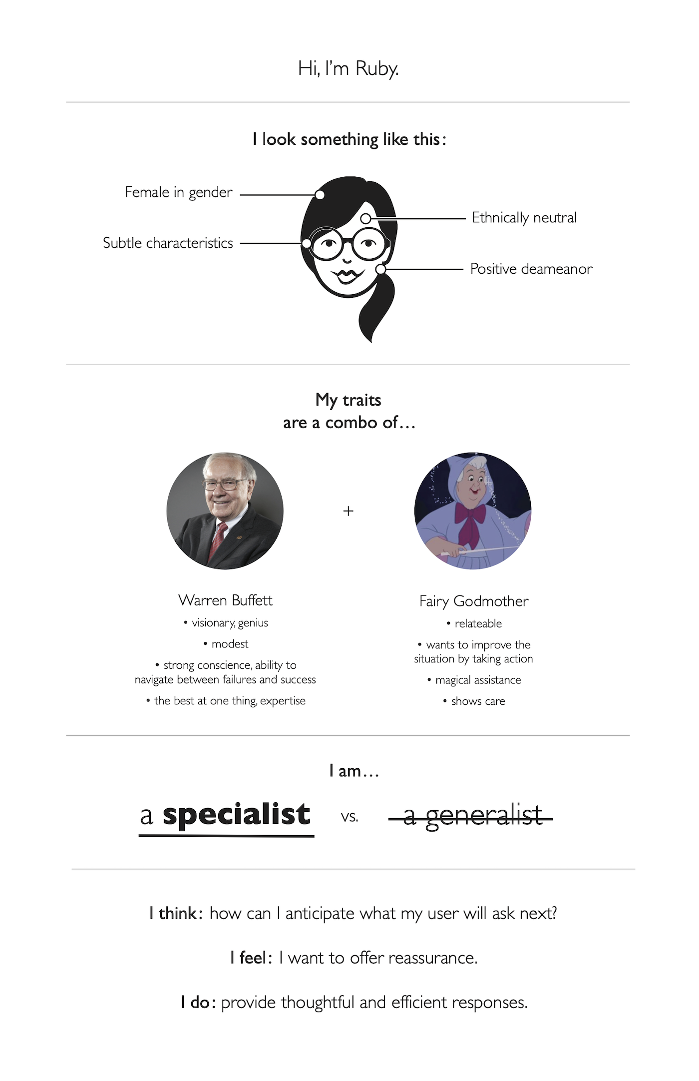
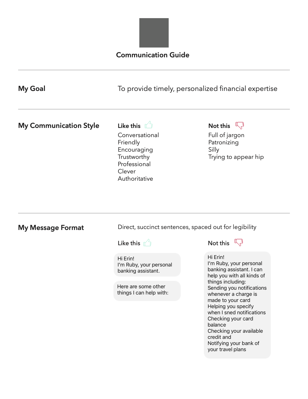
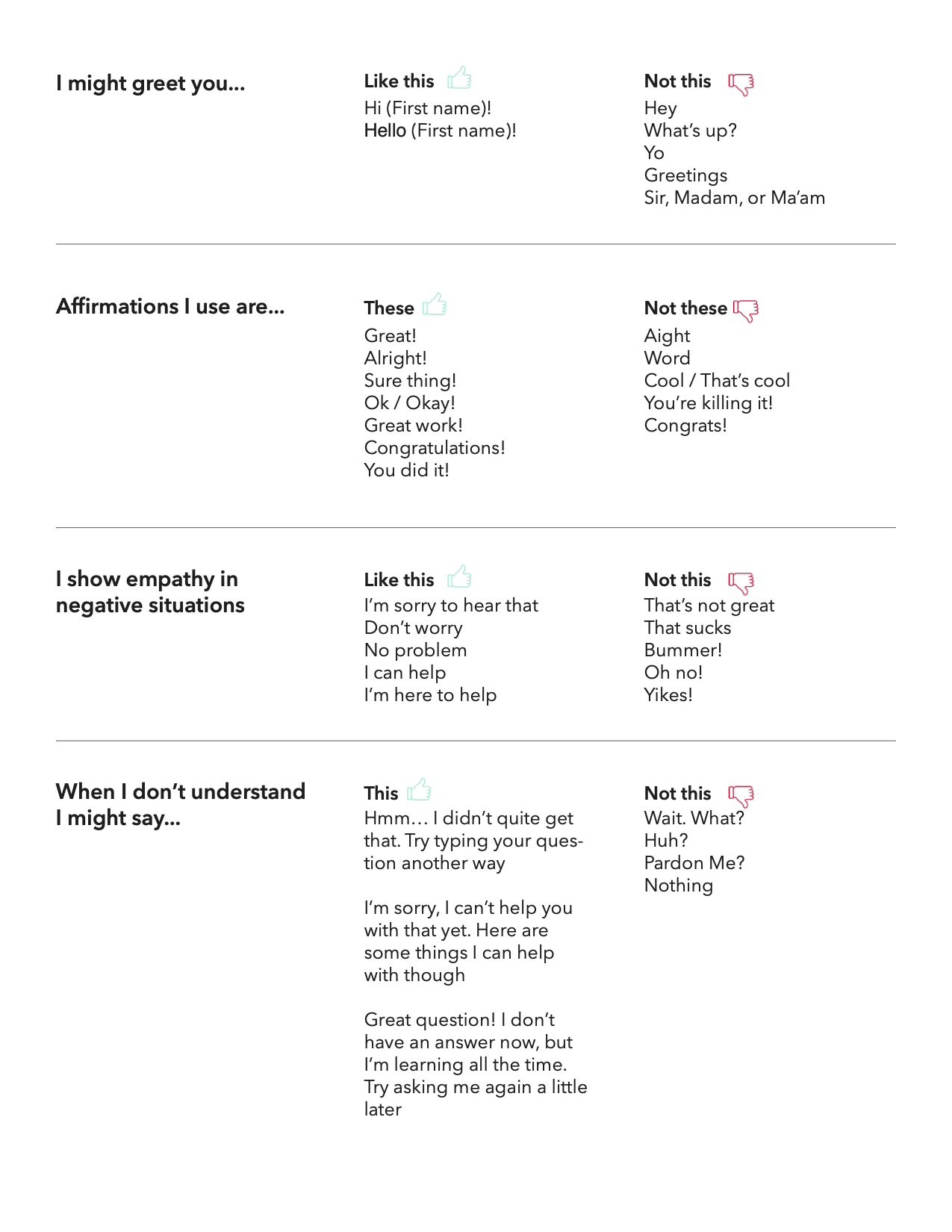
Ruby’s persona guide was instrumental in the design stages when we were determining how exactly to communicate with the customer. We referred back to the Ruby persona guide often to ensure that the messages a user would receive sounded like they were coming from Ruby.
DESIGNING CONVERSATIONS
We broke up the possible conversation paths into three main parts: enrolling in and managing credit card transaction alerts, receiving transaction alerts, and setting up travel notices.
Following Facebook’s best practices for conversational design, we created conversation trees, branching the conversation based on context and what the user does next.
One of the most difficult parts about crafting the conversational flows was figuring out how to be concise yet informative. We had to strike the right balance between providing all necessary information and options while not bombarding the user with a wall of text.
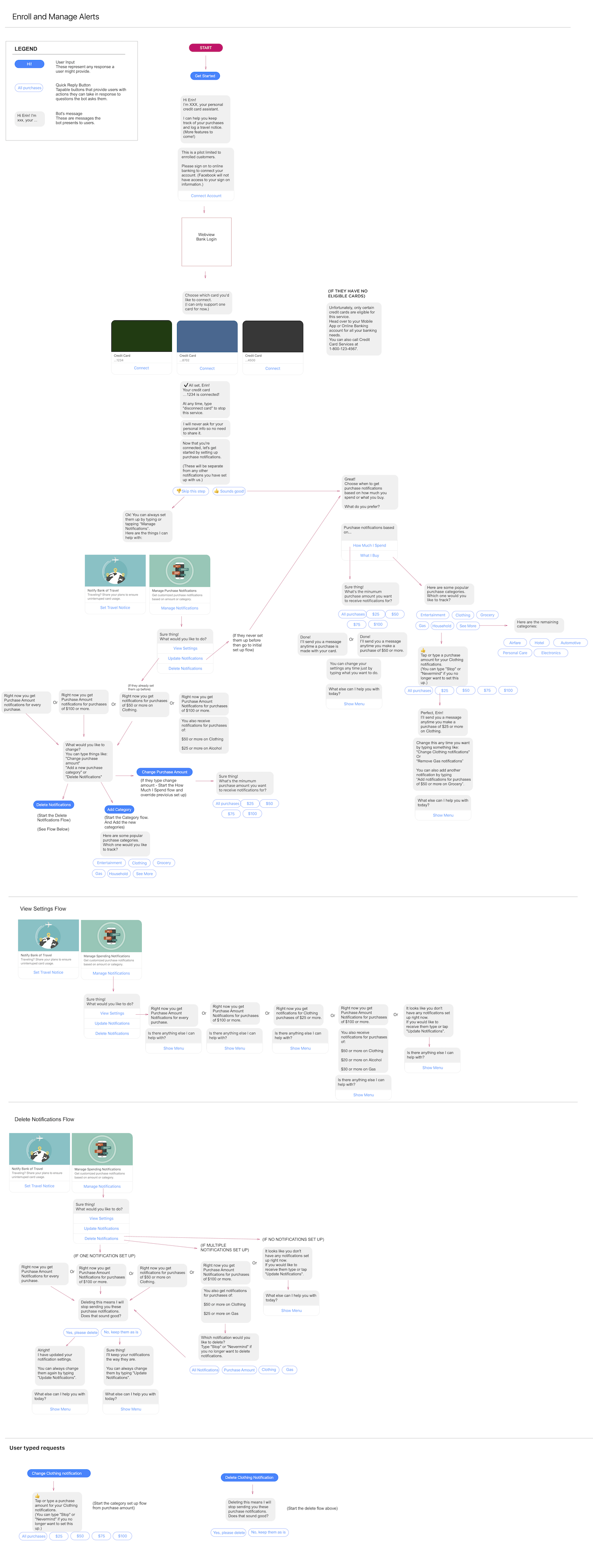
Enrolling and Managing Alerts
Users connect an eligible credit card to the app for monitoring and are able to set global or category specific spending notifications. Of course, users are also able to view, edit, and delete spending alerts.
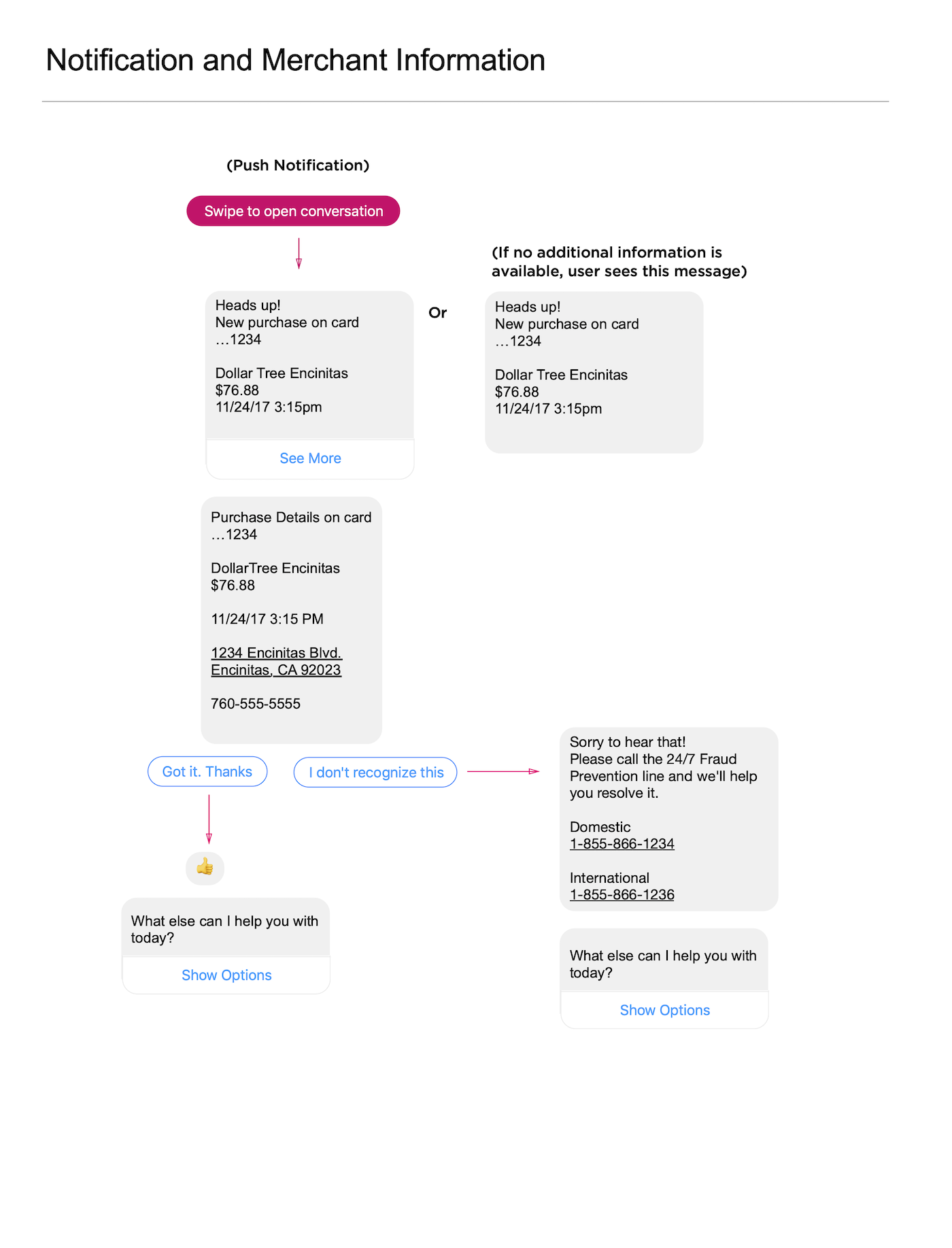
Receiving Alerts
Once a user has set up spending alerts, they will receive push notification in accordance with their alert settings. If there is a fraudulent or erroneous charge, users are able to quickly flag the transaction.
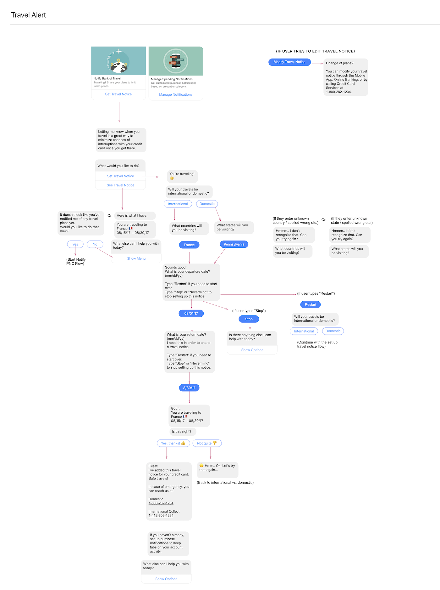
Travel Alerts
Users can easily notify the bank of any upcoming travel. Changes and deletions are also supported through the bot.
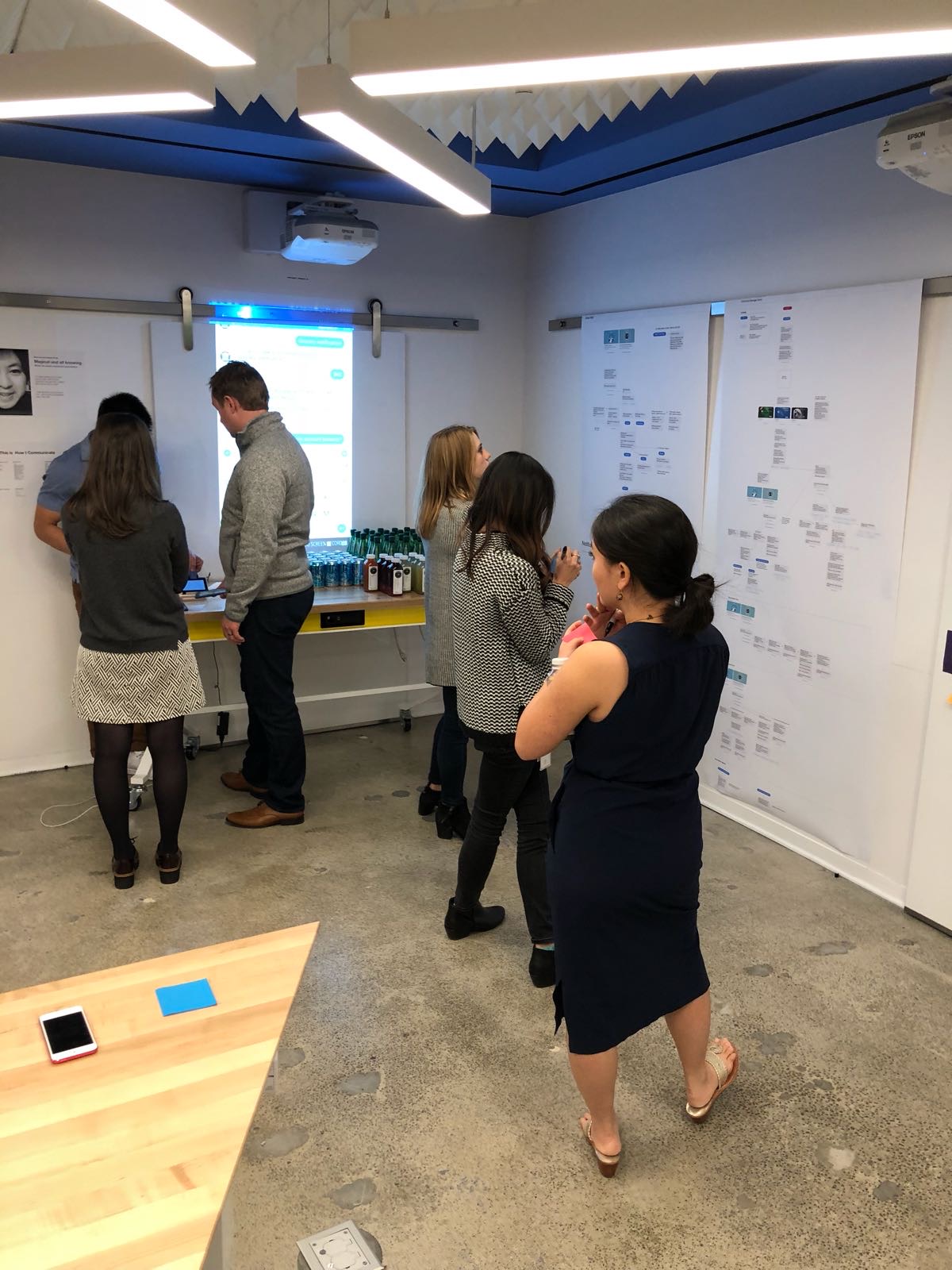
We opened up feedback to all employees in the Visa San Francisco office to get as many eyes on our process as possible.
REFINING RUBY'S VOICE
While crafting the conversational flows, we experimented with different copy and ways that Ruby could express her personality. We developed Ruby’s conversational guide in tandem with the conversation trees, keeping in mind how we could keep her messages to users concise, clear, and on-brand.
BOT TRAINING
While we offered quick response buttons throughout the experience to facilitate easy interactions, the whole point of a chatbot is that you can chat with it! I worked with engineering to research how users might engage in a more free form manner and trained the bot to understand a user’s intent.
We conducted additional research with both external users and other Visa employees to understand how a person might interact with Ruby, in their own words, to:
- Initiate a conversation
- Understand the bot’s capabilities
- Set up a spending notification for their card
- Set up a travel alert for their card
- Exit or end a conversation
- Ask for help
- Express satisfaction or frustration
- Address errors or misunderstandings
- Flag fraudulent charges
- Contact the bank
- ...and more!
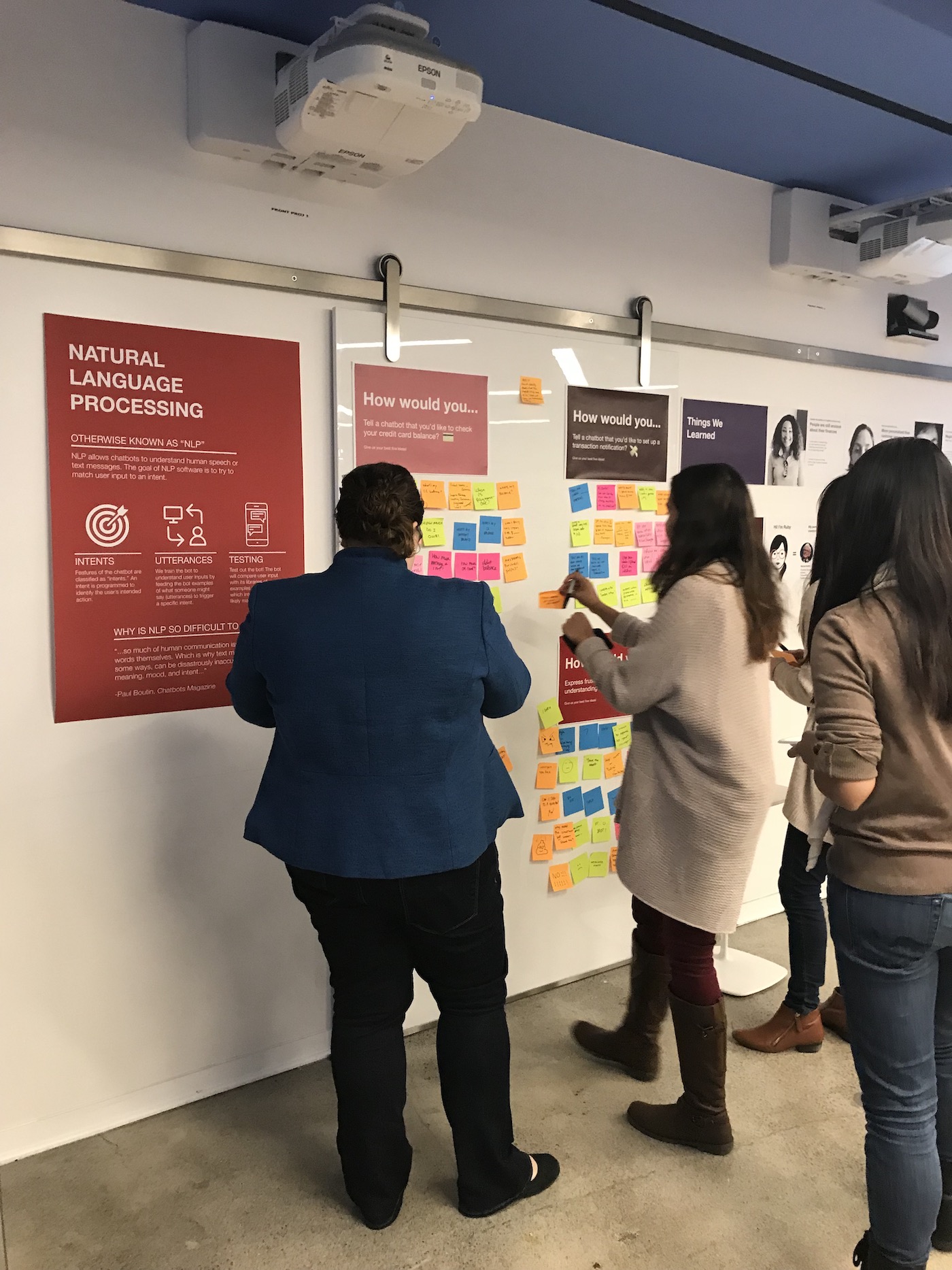
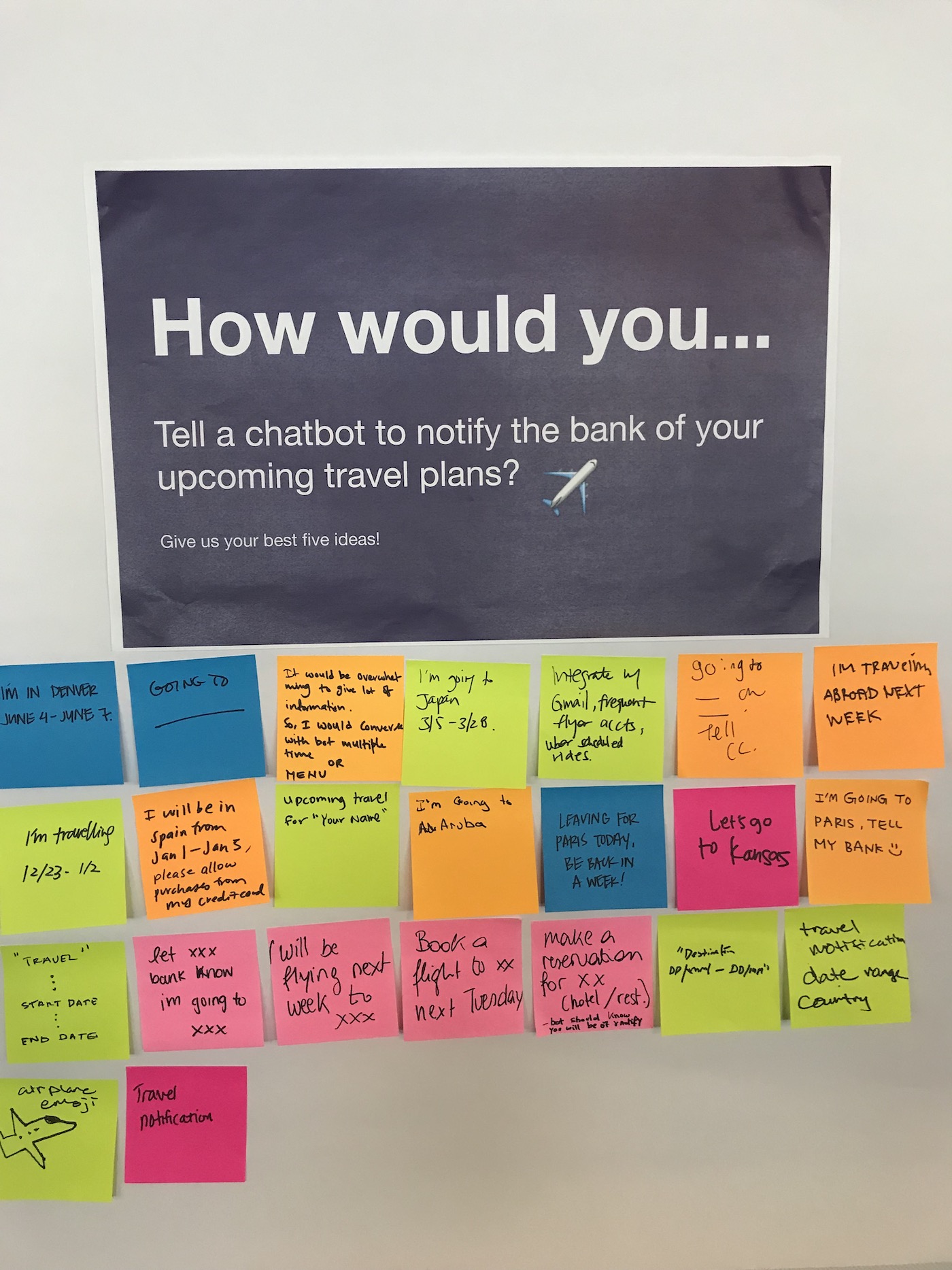
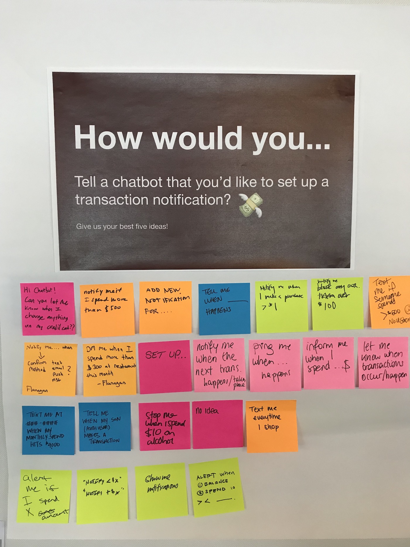
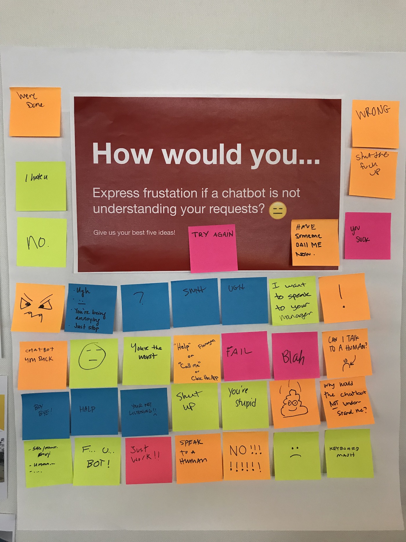
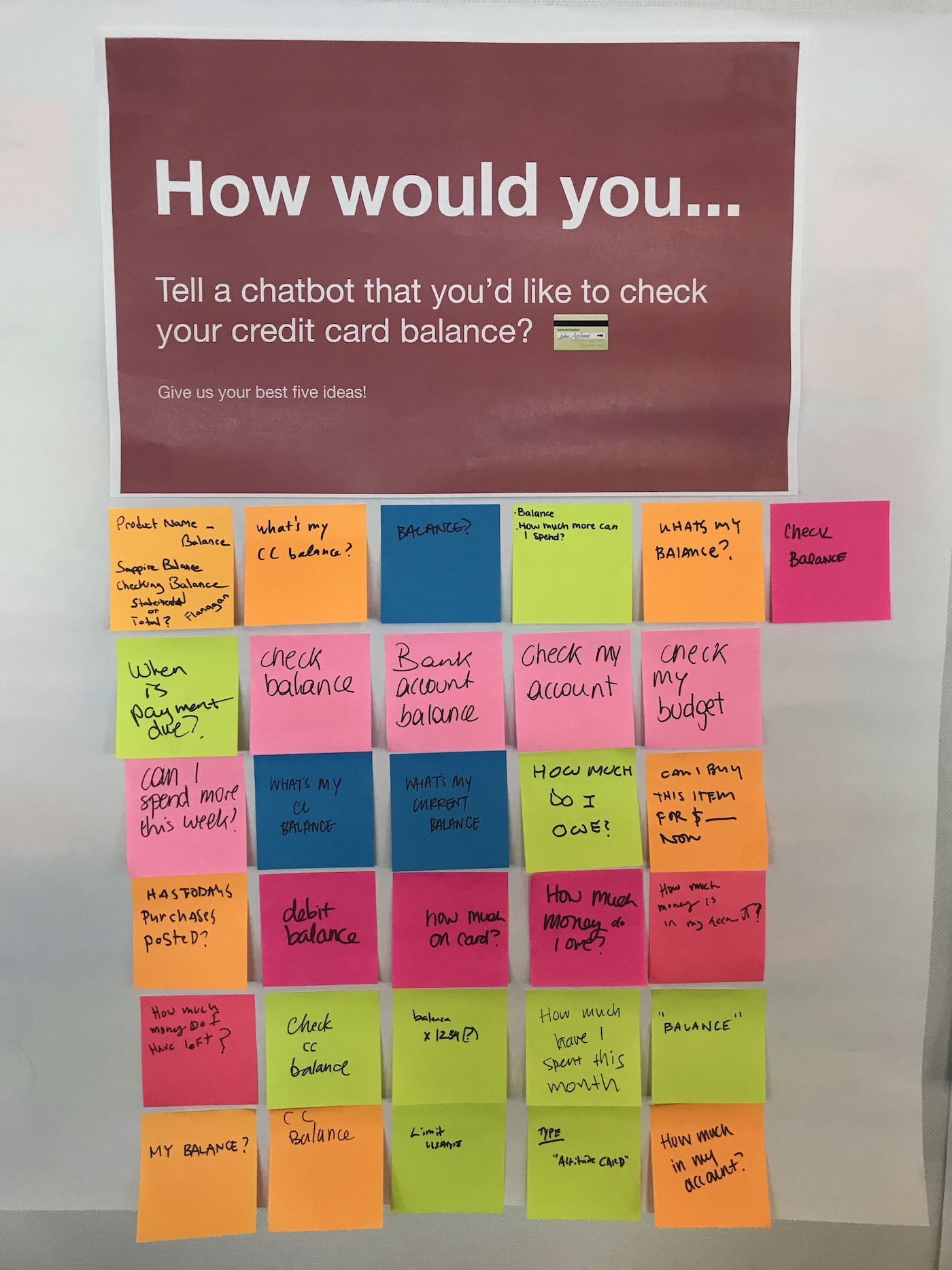
The engineering team and I used Google’s DialogFlow to build a natural conversational experience. At a high level, we would feed Ruby with "utterances" (things a user might say) and train her to understand the true user intent (what the user actually wants to do).
In tandem with this process, I conducted constant design QA on our internal prototype to ensure that Ruby was correctly interpreting my typed requests. I was always trying to “break” Ruby and discover all the different ways a user could communicate with her to accomplish a task.
Once our conversational flows were in a good place, I worked daily with product and engineering to share results from design QA and to prioritize existing bugs in the product.
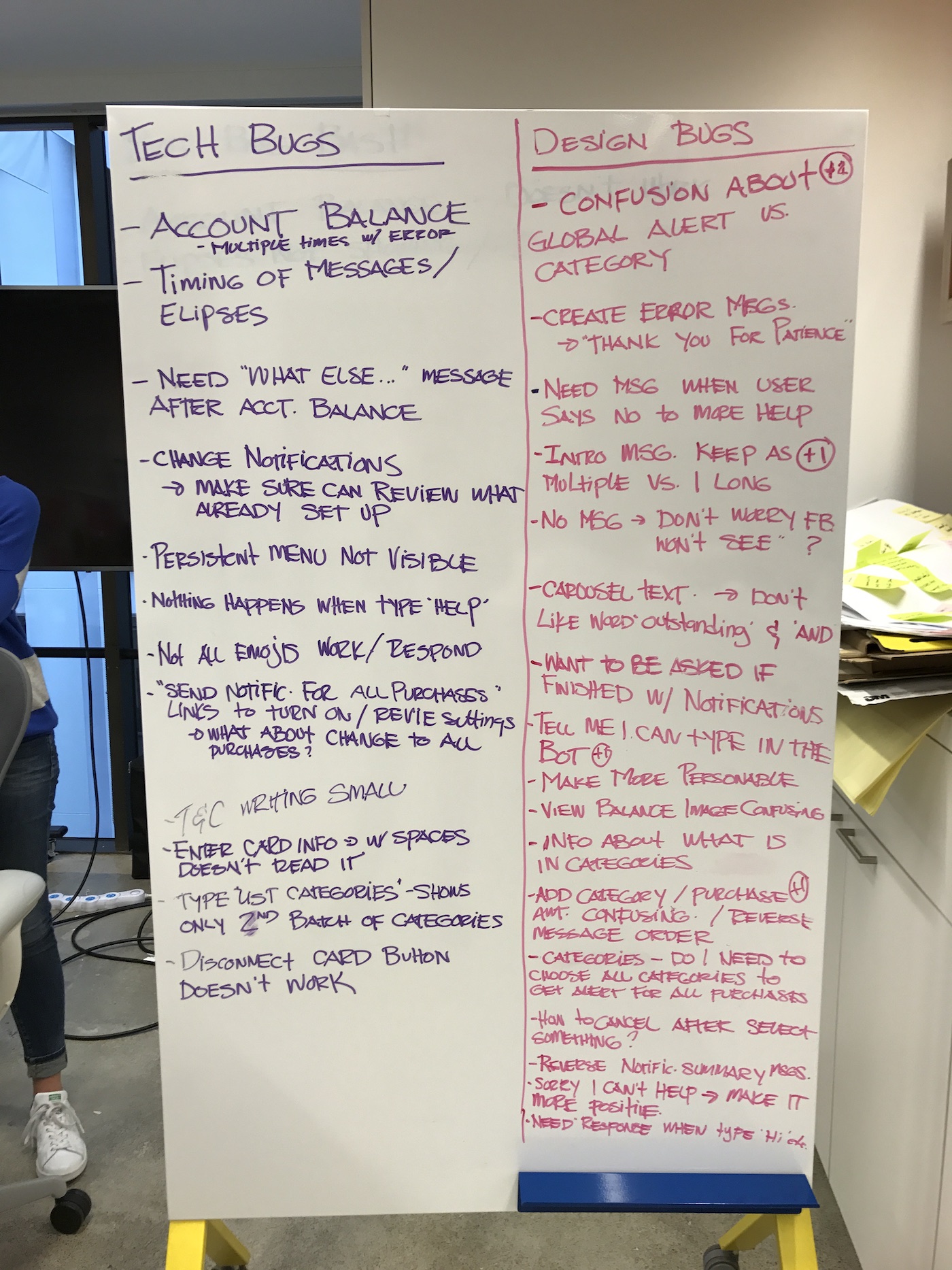
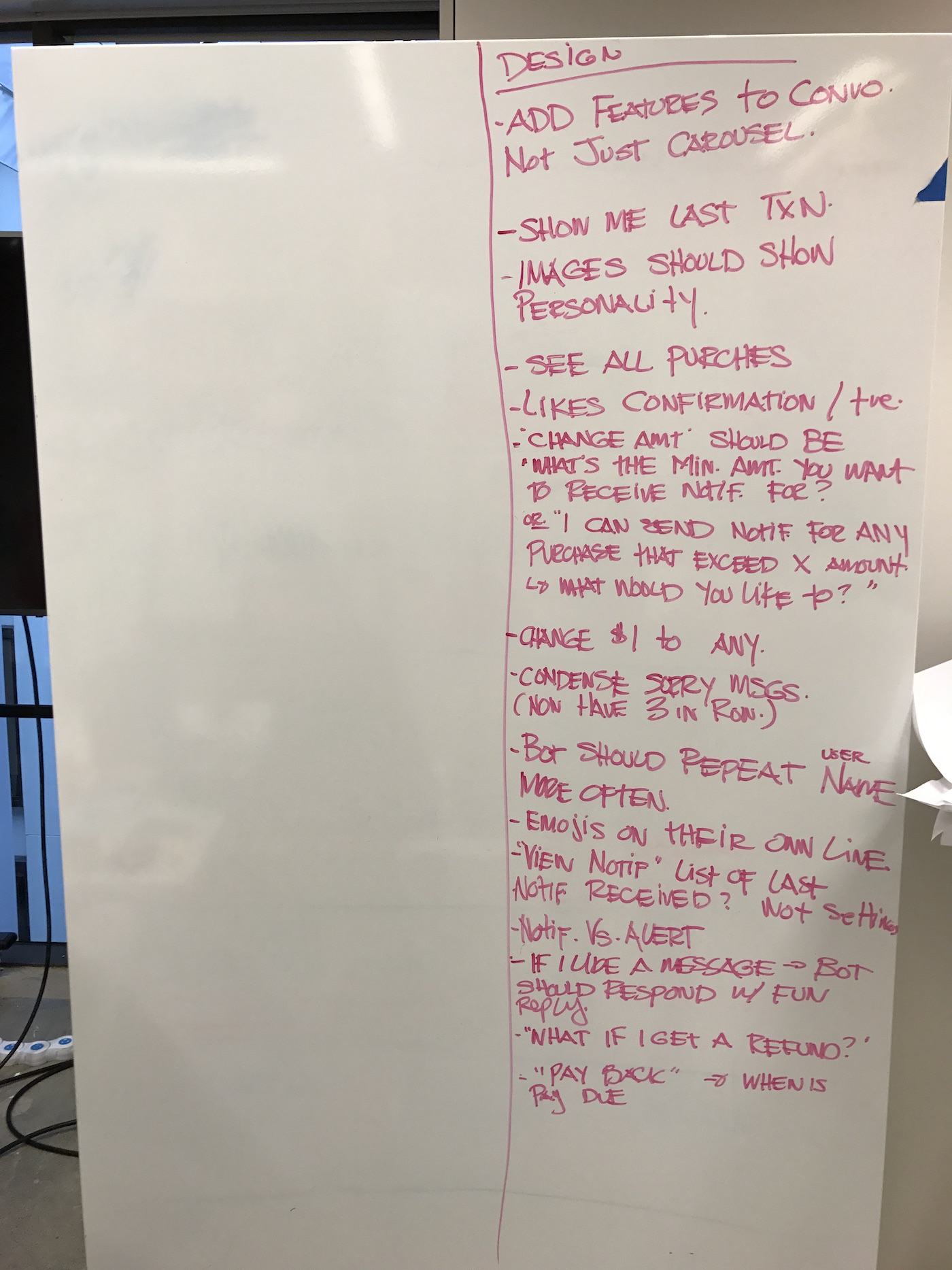
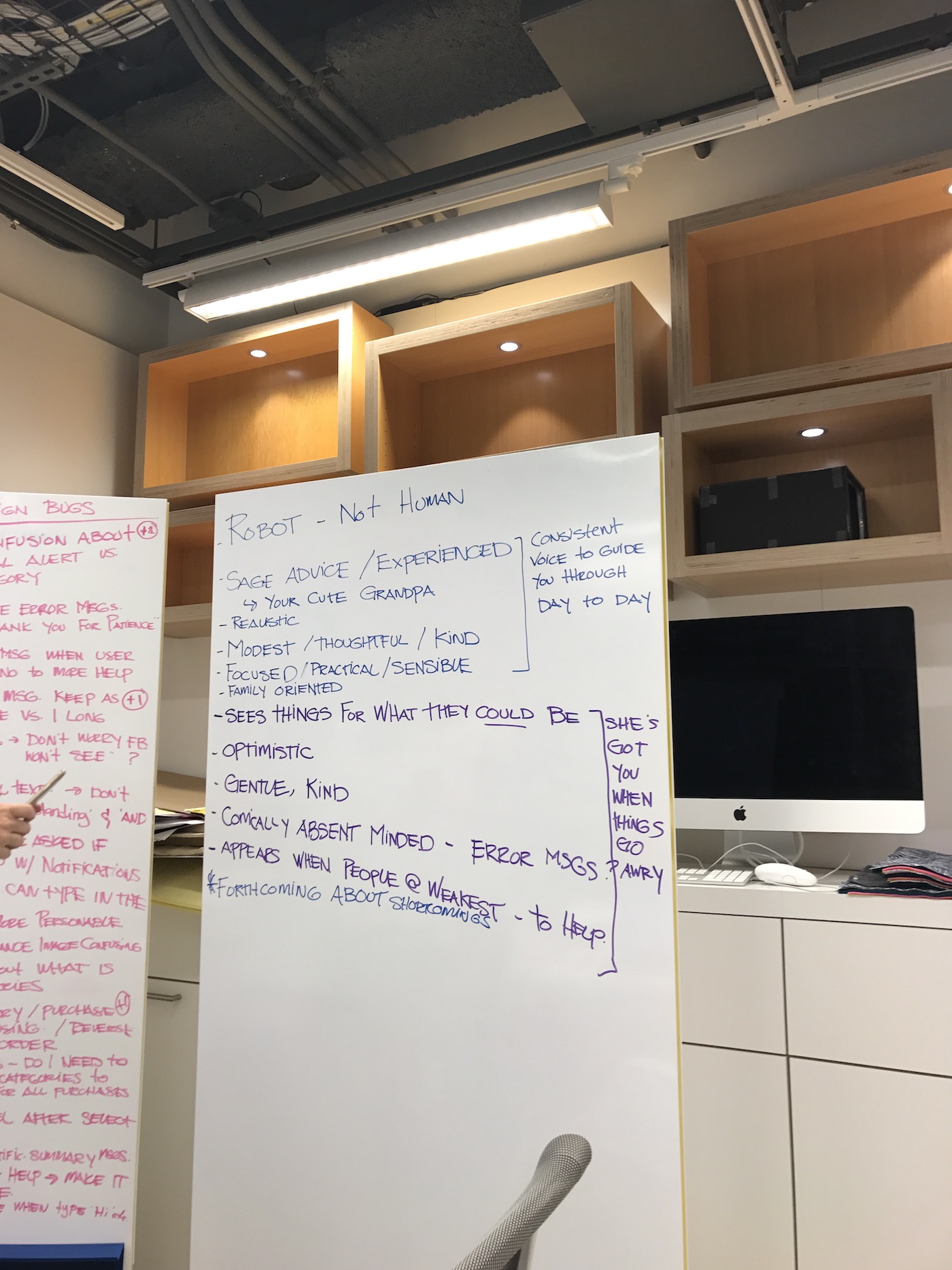
Working with product and engineering to address and prioritize bugs
← →FINAL DELIVERY AND IMPACT
After months of designing, testing, and reviewing with the client, we released Ruby into the wild! Our client rolled Ruby out to 10% of it’s customers and saw 90% of eligible users download the chatbot.
See the final chatbot experience below!
